Case Study PDF System
The Opportunity
Case study PDFs are a steady request for our design team. The content almost always exists already, either as a live case study page on BigCommerce.com or as a copy doc from marketing. Turning it into a PDF meant a designer laying it out in InDesign, every time.
The layout was never the hard part. The rework was. A copy update meant reflowing pages. A new image meant adjusting the layout around it. Another round of edits meant doing it all again, and every round cost time for the designer building it and for the marketers waiting on it.
So while these PDFs need to look sharp, this was a systems project. The goal was to take that repeated layout work off both teams' plates for good.
The opportunity was to let Claude Design handle the first 80%. Give it a URL or a copy doc, get back a PDF that is already on brand, with the layout, type, pagination, and cover done. Export it to Figma, and the design team finishes the last 20%: adding imagery and fixing small spacing issues.
Here is what this covers:
- The goals the system had to meet
- The layout patterns everything is built on
- The randomized cover, designed with Rob Rodriguez
- The workflow from Claude Design to Figma
- What I recommend
The Goals
Before designing any pages, I wrote down what the system had to do:
- Take any input. A live case study URL, a copy doc, or both, plus the customer logo and a few product or lifestyle images.
- Produce the same result every time. Same margins, same type, same structure, no matter who runs it or how they word the prompt.
- Follow the live case study page. The PDF should mirror the page's flow (Challenge, Solution, Results, Looking ahead) and still work when a copy doc arrives in a different order.
- Reach Figma cleanly. Designers should be finishing the file, not rebuilding it.
The main insight: consistency had to come from the template, not the prompt. If a rule only exists in a prompt, it depends on someone typing it. If it lives in the template, everyone gets it for free.
Design Approach: Patterns First
My focus from the start was finding patterns that repeat. I started with margins, padding, and spacing for each type of page, then worked out what information a case study actually shows and how it should be ordered. Everything else is built on those decisions.
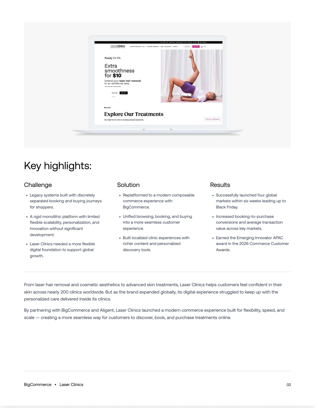
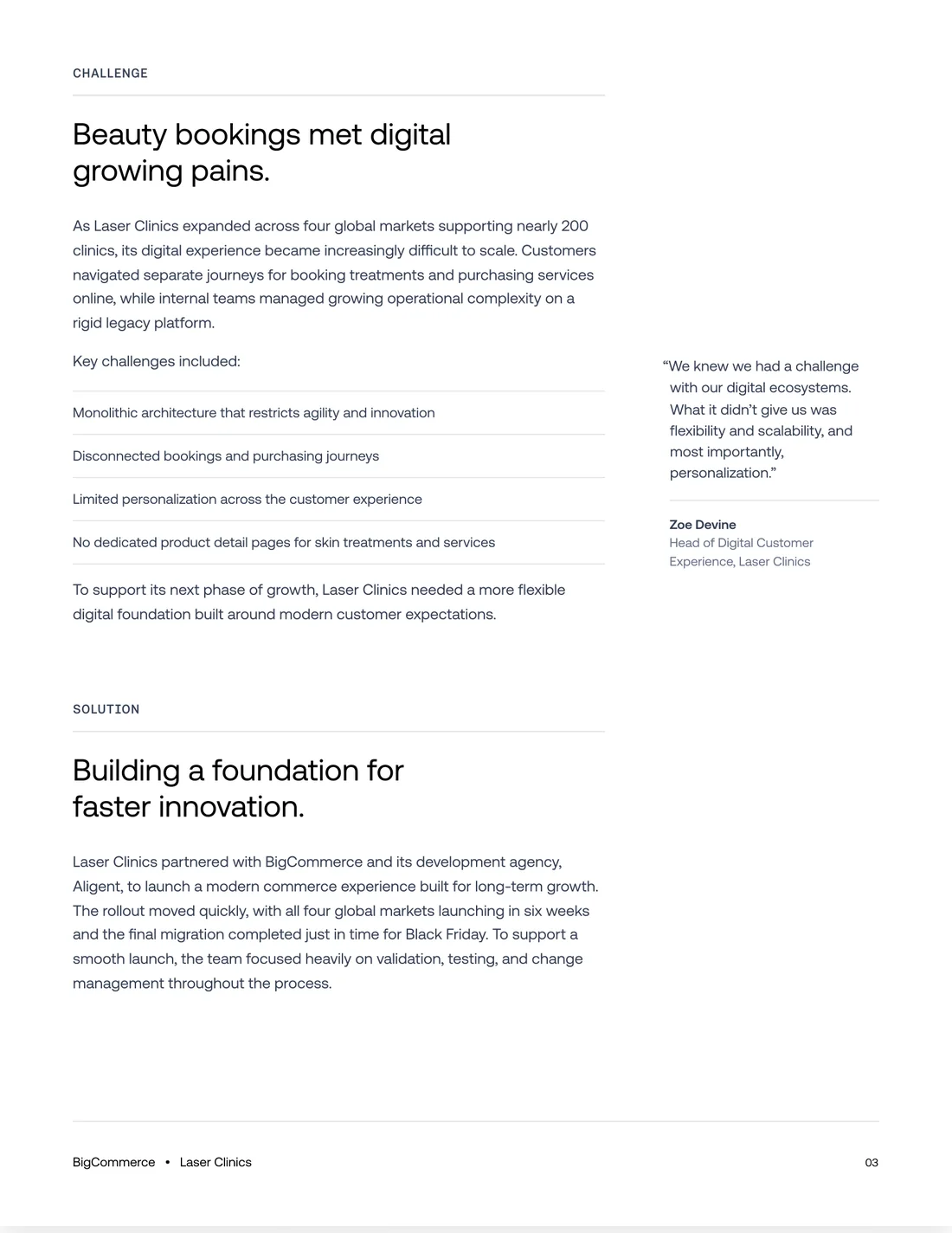
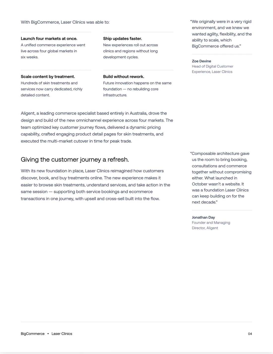
The template has four kinds of pages, and each has its own layout:
Cover
Hero + Key Highlights
Flow Pages
Closing
Every Page
I spent the most time on the rules you only notice when they break. These are the ones that separate a real PDF from a long web page cut into pieces:
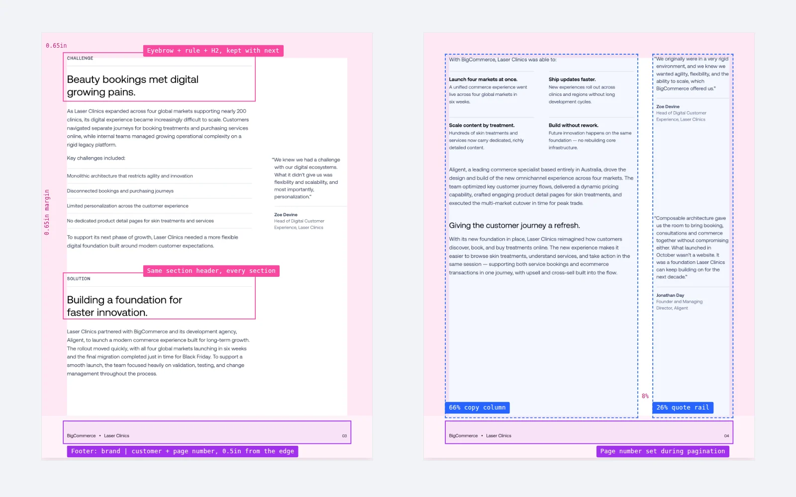
- Footers stay at the bottom of every page. Brand, customer, and page number sit 0.5in from the edge whether the page is full or half empty.
- Page numbers are always right. They're set while the pages are built, so adding or removing a paragraph never leaves a stale number behind.
- Headings stay with their content. Section headers are kept with the next block, so a headline never ends up alone at the bottom of a page.
- Quotes stay in the rail. A pull quote that won't fit moves to the next page's rail and lines up with the top of its section. It never drops into the copy column.
- Pages break after the fonts load. Measuring with fallback fonts shifts every break, so the template waits for the real ones.
- Images get room. 24px of padding inside the gray frame and at least 28px above and below, so copy never sits tight against an image.
Cover Design
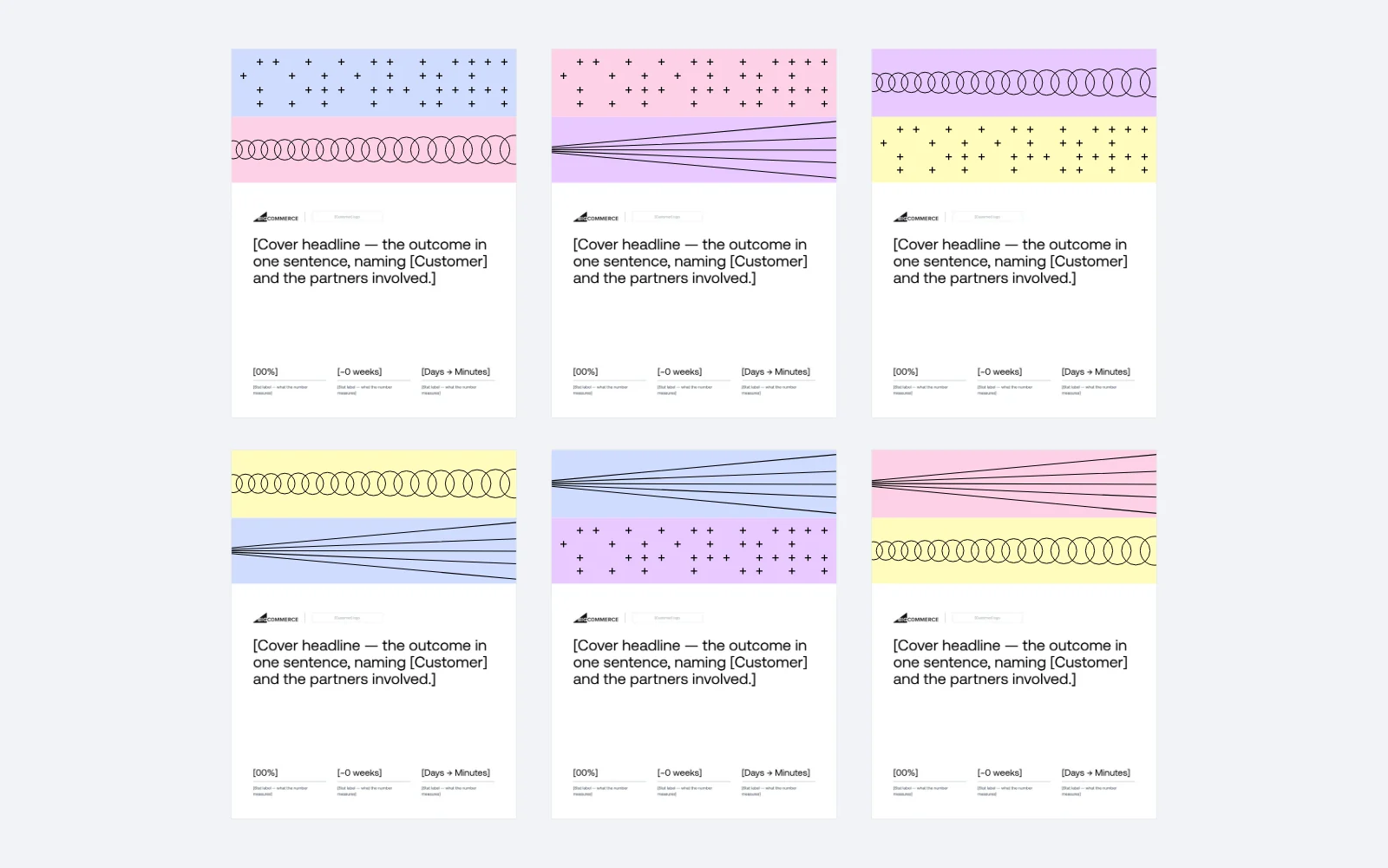
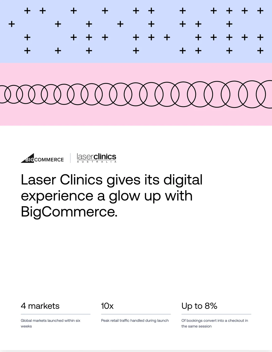
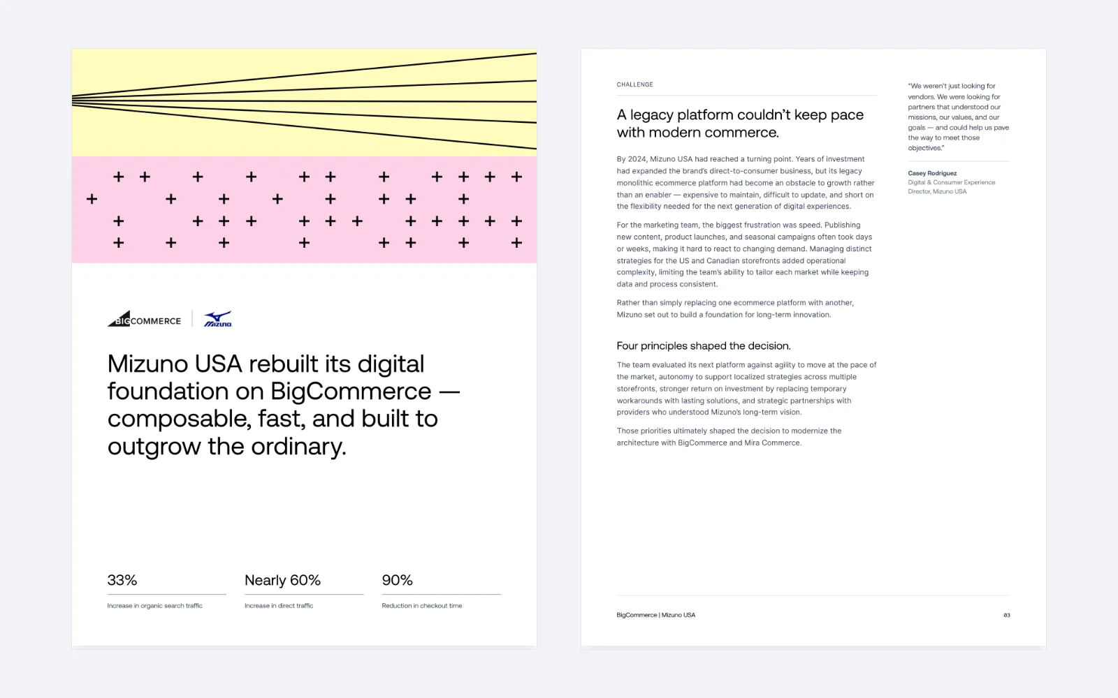
I worked with our brand designer, Rob Rodriguez, who I also partnered with on the Feedonomics rebrand. Rob designed the cover and its illustration variants: three line patterns (plus signs, circles, and radiating lines) set on the BigCommerce system's pale tints, Mist, Rose, Mauve, and Lemon.
I set the cover up so every PDF picks two different patterns and two different tints at random. That makes 72 possible covers. Every one is slightly different, and every one is clearly part of the same family, so a stack of case studies looks like a series instead of copies.
The BigCommerce design system doesn't allow patterns in general, so the cover bands live inside this template and nowhere else. The randomness has limits, and those limits are what keep it on brand.
The Workflow
The template lives inside the BigCommerce design system I built in Claude Design, next to the tokens, type, components, slide system, and a one-pager and whitepaper template. Running it takes a few steps:
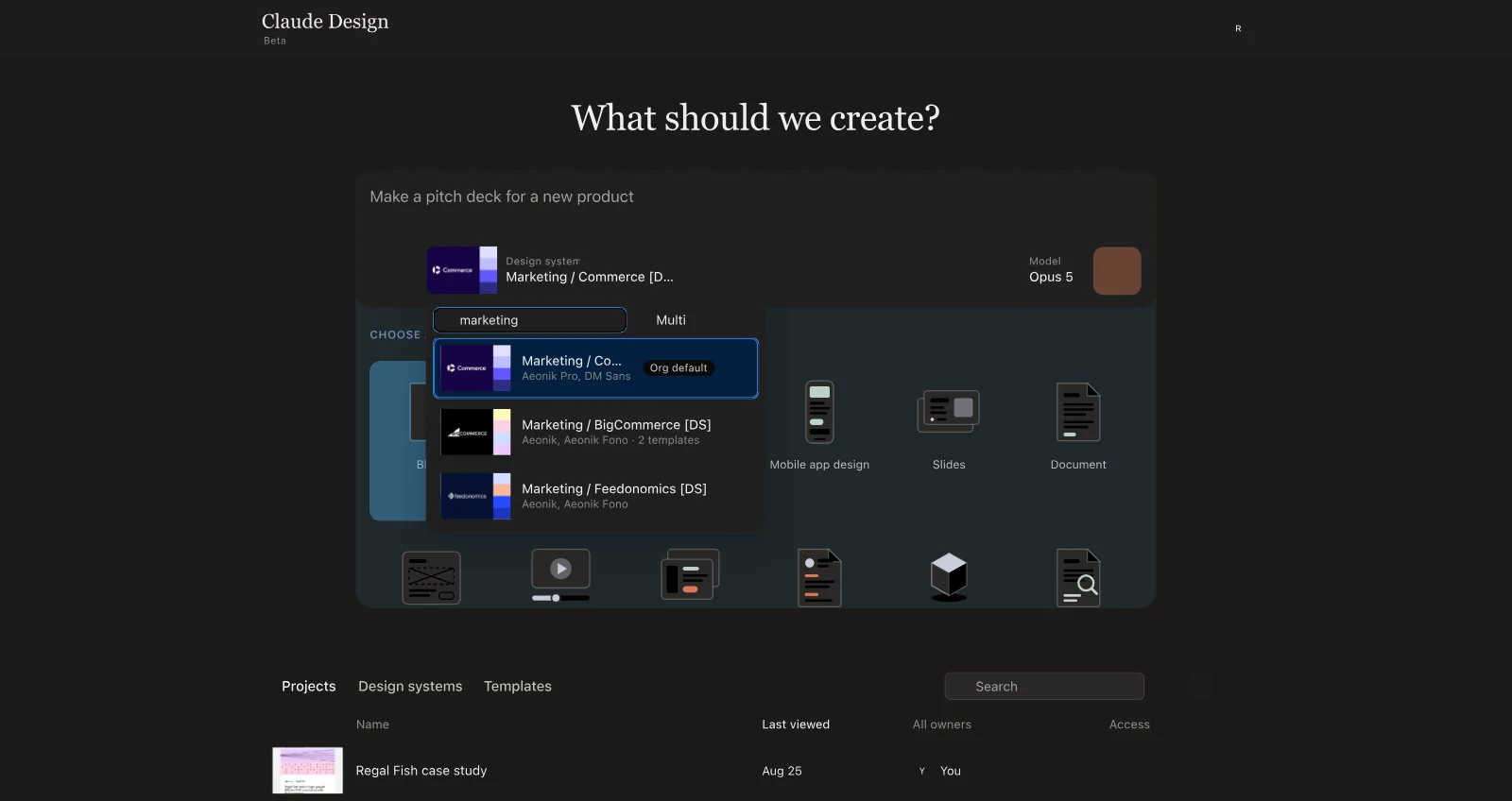
- Start in Claude Design. Choose the BigCommerce design system, drop in a copy doc or case study URL, and ask for a case study PDF. Attach the customer logo and a couple of product or lifestyle images.
- Refine in the chat. If copy length, layout, or image placement is off, fix it in Claude Design first. It's faster to iterate there than after export.
- Export as standalone HTML. This bakes the fonts, logo, and every image into one file, so there are no linked assets left to break.
- Import with html.to.design. Auto layout, styles and variables, existing local styles, hyperlinks, and HTML layer names on, then ungroup in Figma.
- Finish in Figma. Designers add final imagery, clean up any spacing or type that shifted during import, and check the hyperlinks.
To roll it out, I walked the design team through the whole flow in a working session with a live demo. The goal was simple: everyone runs a case study at least once and leaves knowing which route to use.
The Output
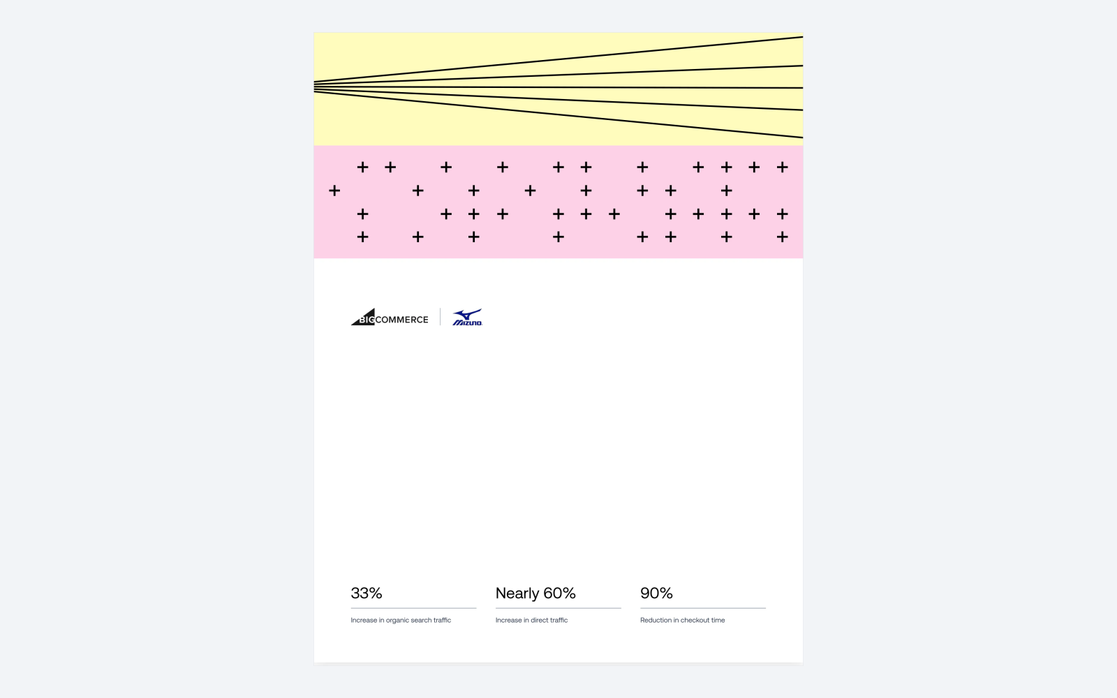
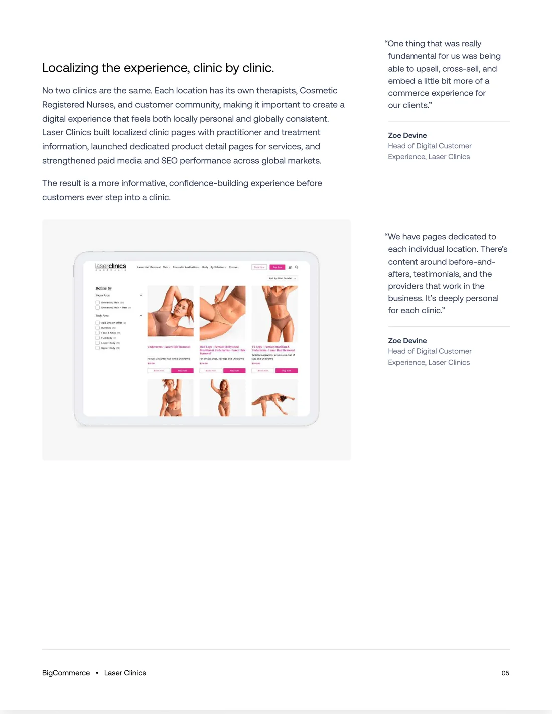
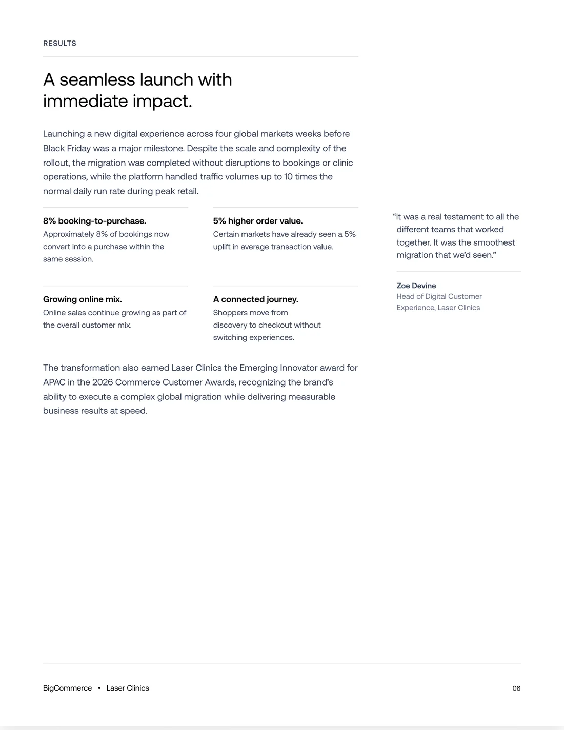
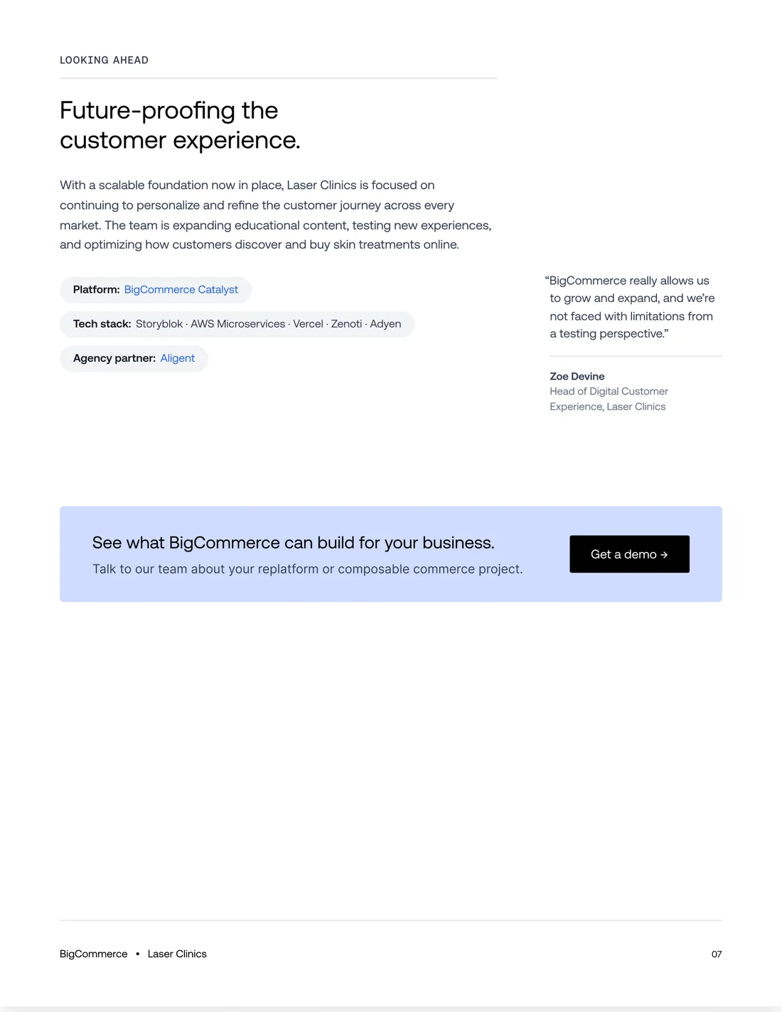
Two case studies from the system, for Laser Clinics and Mizuno USA. They're different customers with different amounts of copy, built on the same margins, footer, section structure, and cover family.
My Recommendation
Treat case study PDFs as an 80/20 job. Claude Design is very good at structure: layout, type, pagination, and staying on brand across seven pages. Designers are still the right people for the last 20%, choosing imagery and catching the small spacing issues an import can introduce. That matches how we tiered our brand systems in Claude Design: PDFs go through design, and the system does the heavy lifting first.
In practice, that means three things. Keep the rules in the template, not in the prompt. Refine in Claude Design before exporting, while changes are cheap. And make standalone HTML with html.to.design the default route into Figma, so every file arrives with its fonts and images intact.