Brand Systems in Claude Design
The Opportunity
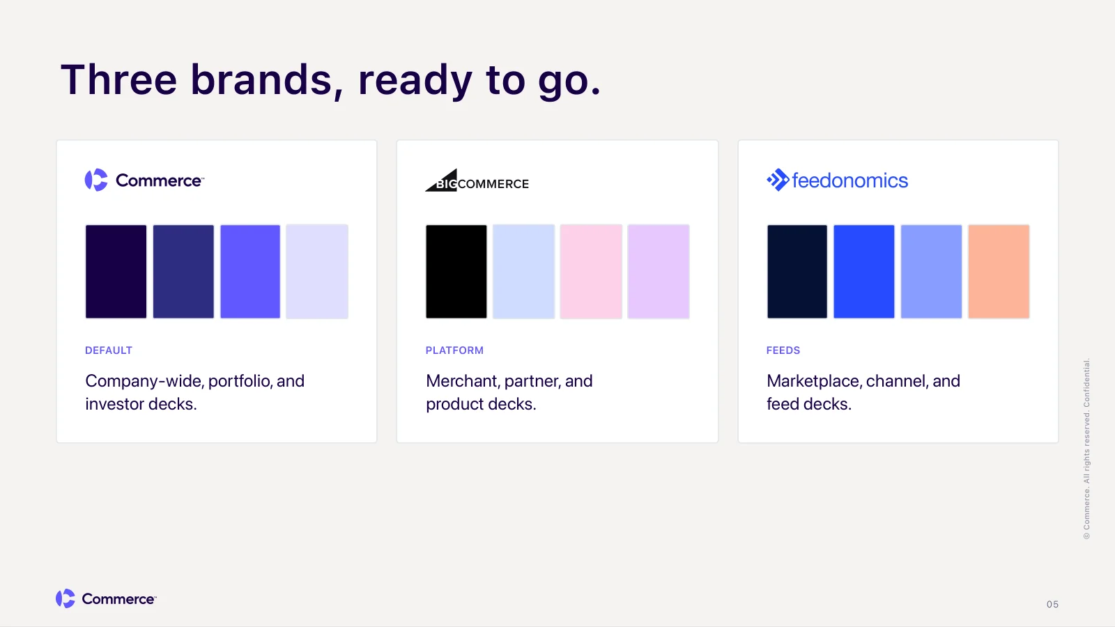
Commerce is the parent company behind BigCommerce and Feedonomics. Three brands, each with its own colors, type, and voice, and one design team supporting all of them.
A lot of what reaches that team isn't design work. It's a sales deck that needs to look right, a team update for leadership, a partner overview due tomorrow. Most of the time people build these themselves in Google Slides, and every deck passes through a lot of hands. By the time it reaches the brand team, the fonts have drifted, the colors are close but not quite right, and a logo is stretched. Reviewing all of that takes time the brand team doesn't have.
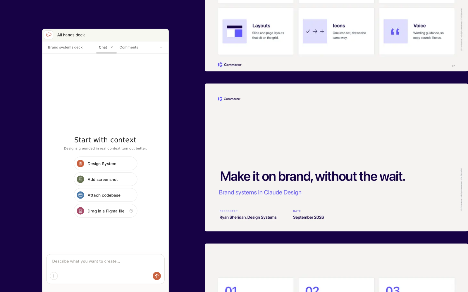
When Claude Design came out, I wanted to learn it properly, not just try it. A design system in Claude Design isn't a library you reference. It's an environment that builds with you, and anyone at the company can open it. That made it a real chance to give people a way to make on-brand work without a designer in the room.
Here is what this covers:
- Who it's for and what it had to do
- How I learned the tool and built the systems
- Three brands, three systems
- Decks, the biggest time saver
- From a brief to a finished deck
- Rolling it out
- What I recommend
Who It's For
This wasn't built for designers first. It was built for everyone else at the company: sales, marketing, product, content writers, and leadership, all the way up to our CEO. The goal was to take weight off the brand team, not to add another tool for designers.
That changed how I built it. A designer knows what a token is and why a logo needs clear space. Most people opening this don't, and shouldn't have to. So every brand rule had to live inside the system, where it applies on its own, rather than in a guideline doc someone has to find and read first.
The Goals
Before building anything, I wrote down what the systems had to do:
- On brand without a designer. Someone who has never opened a brand guide should still get colors, type, logos, and voice right.
- One system per brand. Commerce, BigCommerce, and Feedonomics each get their own system, and none of them borrow from the others.
- Rules live in the system, not the prompt. If a rule only exists in a prompt, it depends on someone typing it. If it lives in the system, everyone gets it for free.
- Get people 90% of the way there. The system handles layout, type, and brand. People add their own images and final details.
Learning the Tool
Every system started the same way, from three documents: the brand guidelines, a token spec exported from our multi-brand Figma system, and an output spec listing what the system should produce and at what size. From those, Claude Design built the tokens, type, logos, voice rules, a marketing UI kit, and a slide system for each brand. Because every system started from the same three inputs, the process is repeatable for any brand we add later.
Getting from a first draft to something people could trust took a lot of iteration, and two habits made that faster.
I talked to it like a designer. Most of my requests were dictated in plain language, the same way I'd give feedback in a design review. "This illustration feels basic, here's a spacing and grid style I like, make it a light version in our colors." "Cards across the deck feel too bubbly, tighten them up." When a slide went too far, I asked for simpler options, and got a detailed, a medium, and a simple version to choose from.
I used Claude as a second opinion. For bigger fixes, I'd let Claude Design investigate and propose a plan, then paste that into a separate Claude chat to pressure-test it. Claude would help me make the calls and write back a precise answer, and I'd paste that into Claude Design. Going back and forth between the two caught bugs faster than either one alone, and made sure every fix landed at the system level instead of on one slide.
Three Brands, Three Systems
My first instinct was one system for every brand. It didn't work. When brands share a system, everything starts to blend: Feedonomics pages pick up BigCommerce styling, and sister-brand logos show up where they shouldn't. People can hold brand context in their heads. AI can't, and if two things can be confused, they will be.
So each brand got its own system, and each one forbids the others' tokens, type, and visuals. The same principle runs through our Figma library: shared foundations, separate brands.
Commerce
BigCommerce
Feedonomics
Decks, the Biggest Time Saver
Of everything the systems can make, decks save the most time. They're also the thing people outside design build most often, and the thing that drifts off brand fastest.
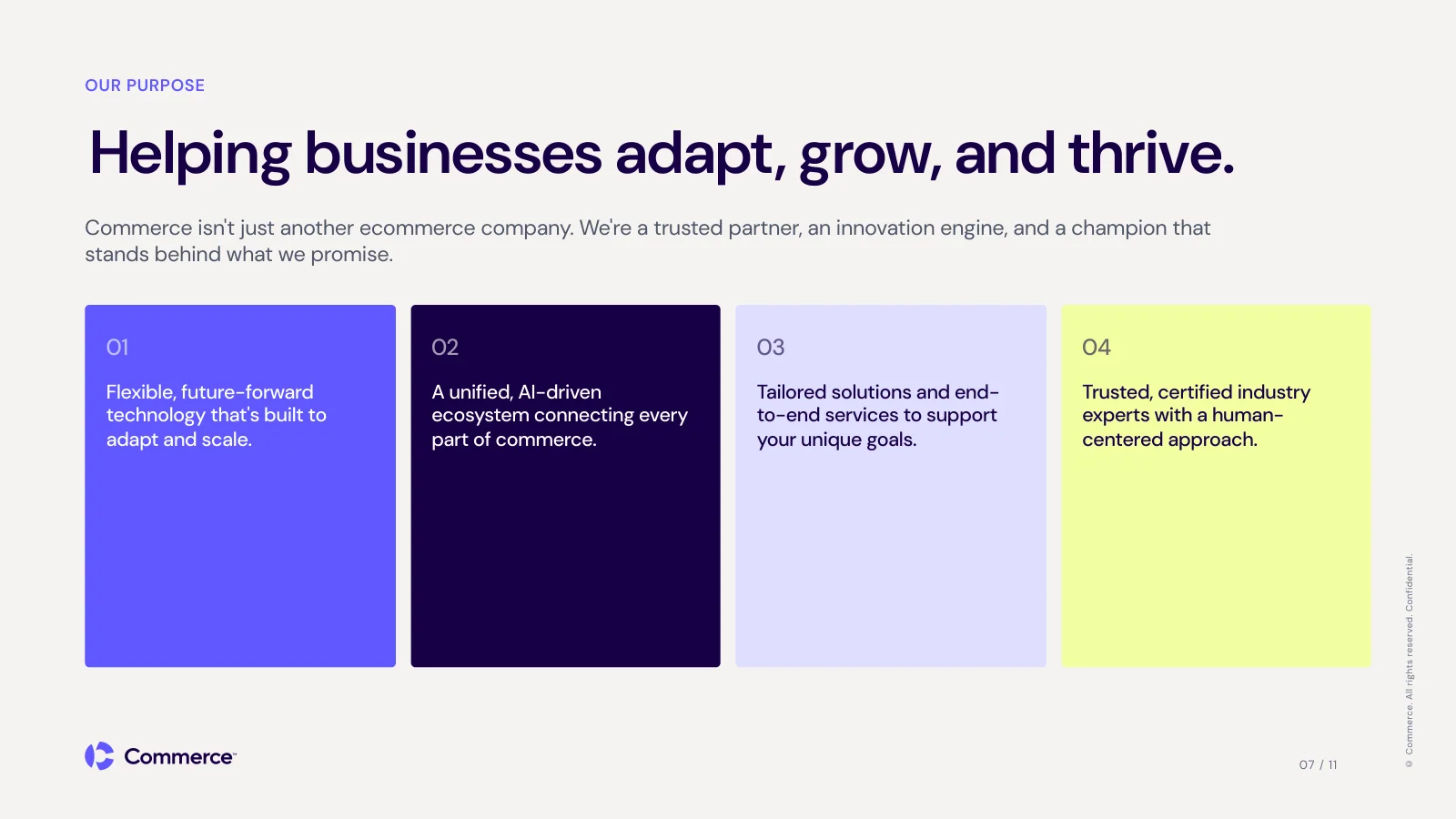
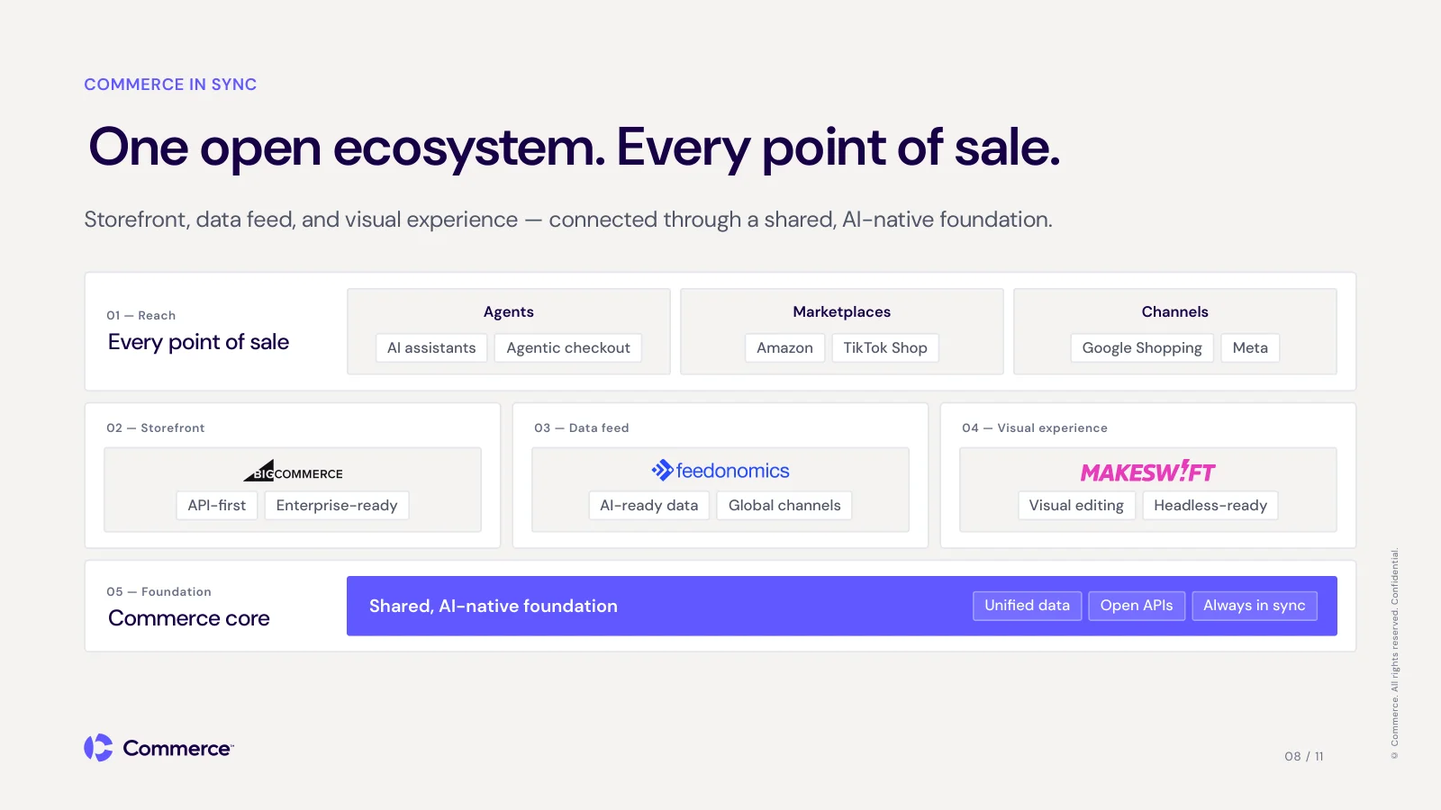
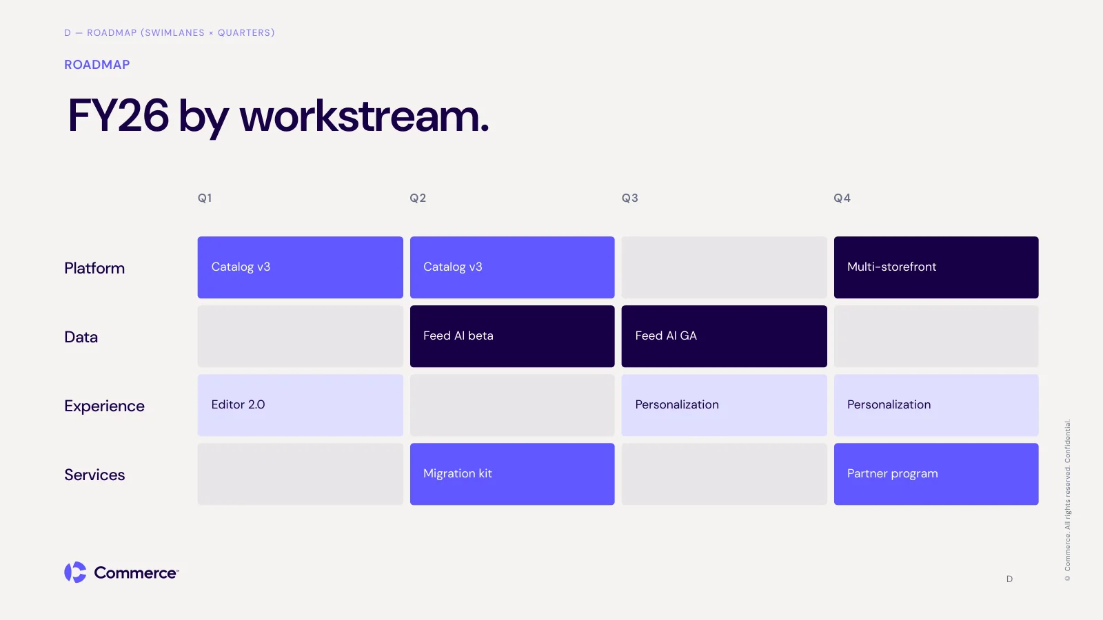
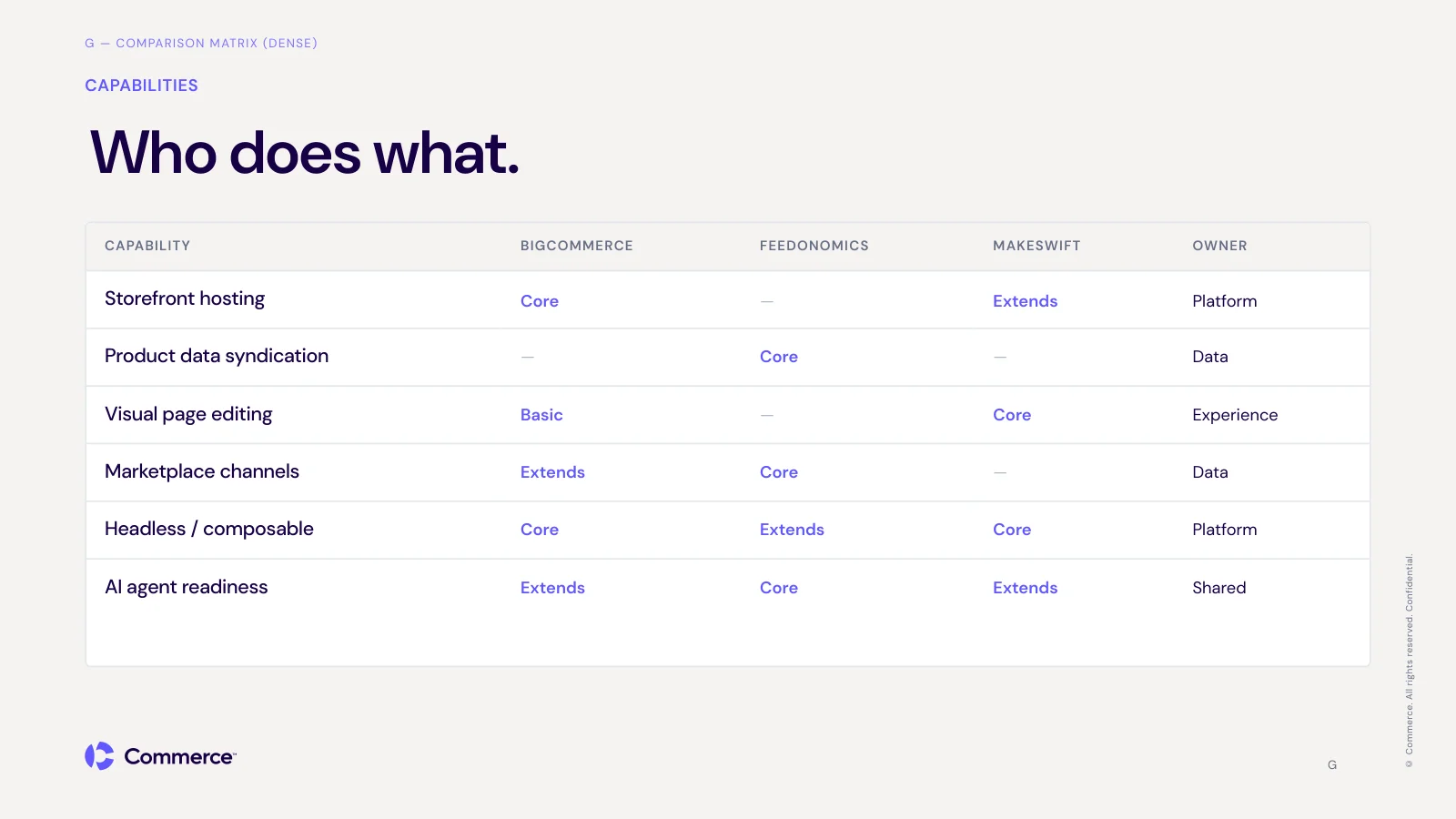
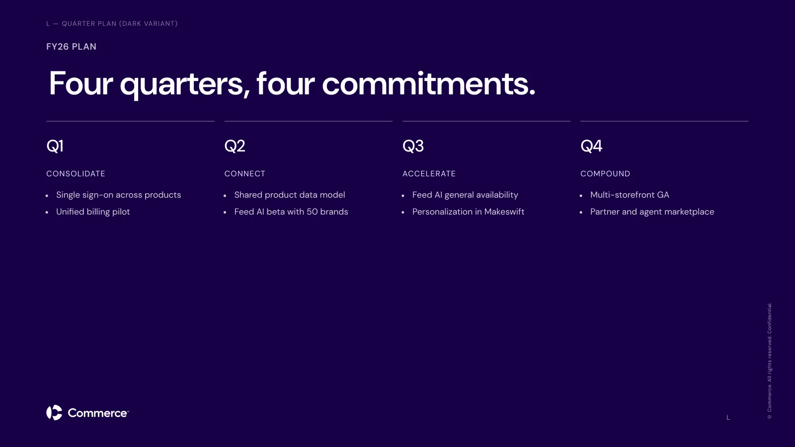
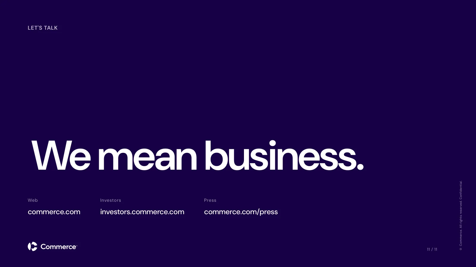
Each system has its own slide set at 1920×1080: covers, section dividers, content, stats, big quotes, card grids, tables, and closing slides. Someone picks a brand, describes what they need in plain language, and gets a deck that is already on brand. It isn't perfect. But it gets them about 90% of the way there, and they finish it by adding their own images and a few details. For the brand team, that means decks show up already using the right type, color, and logos.
The template
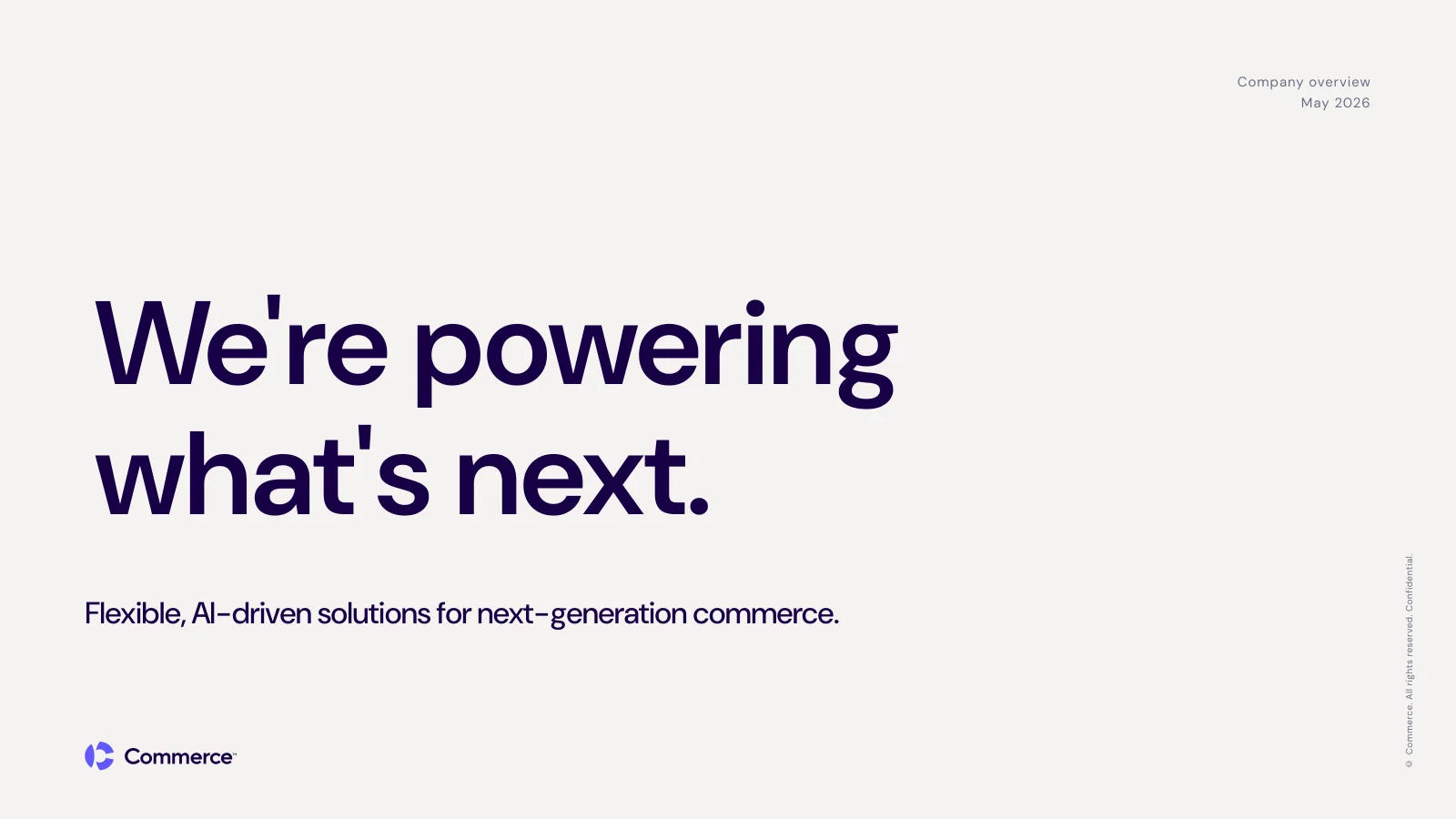
The Commerce template deck, plus a few of the extra layouts the system can pull from.
From a Brief to a Finished Deck
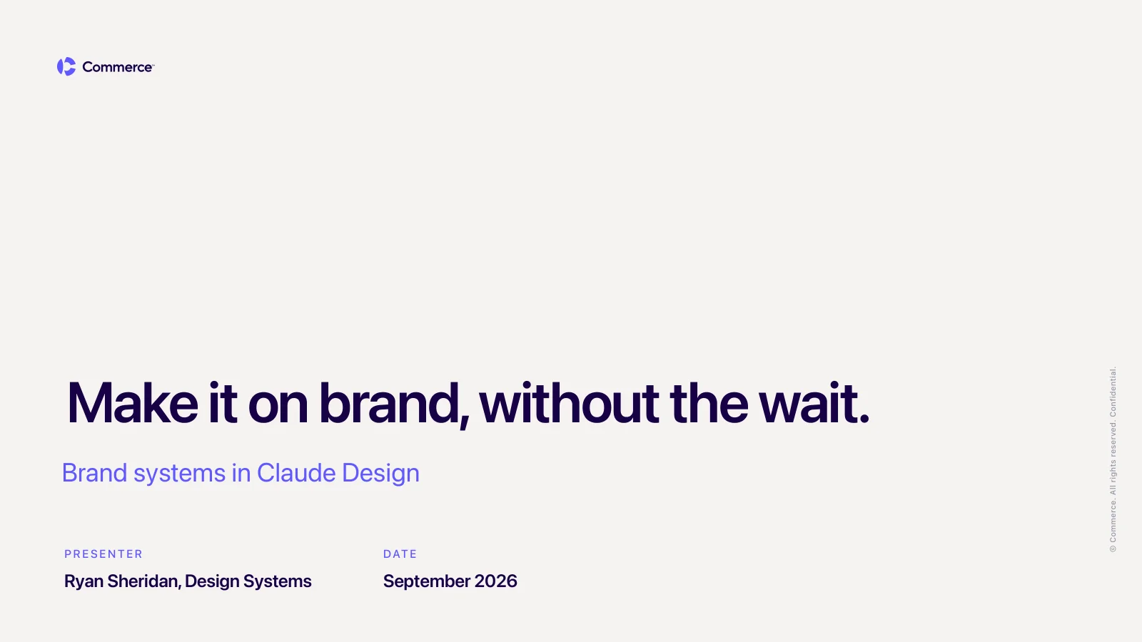
To show what that looks like, I wrote a short brief the way a coworker would: plain notes, no design direction, just the copy for each slide and a line saying "keep it simple, most people watching aren't designers." I dropped it into the Commerce system and asked for a deck.
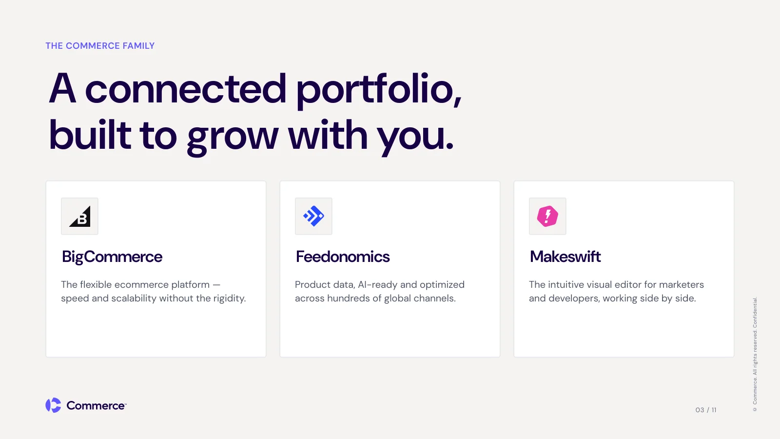
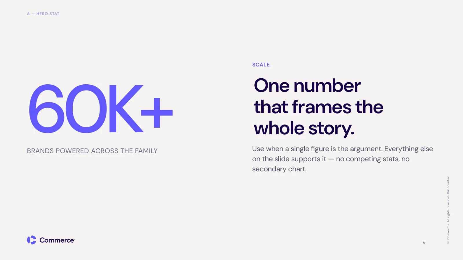
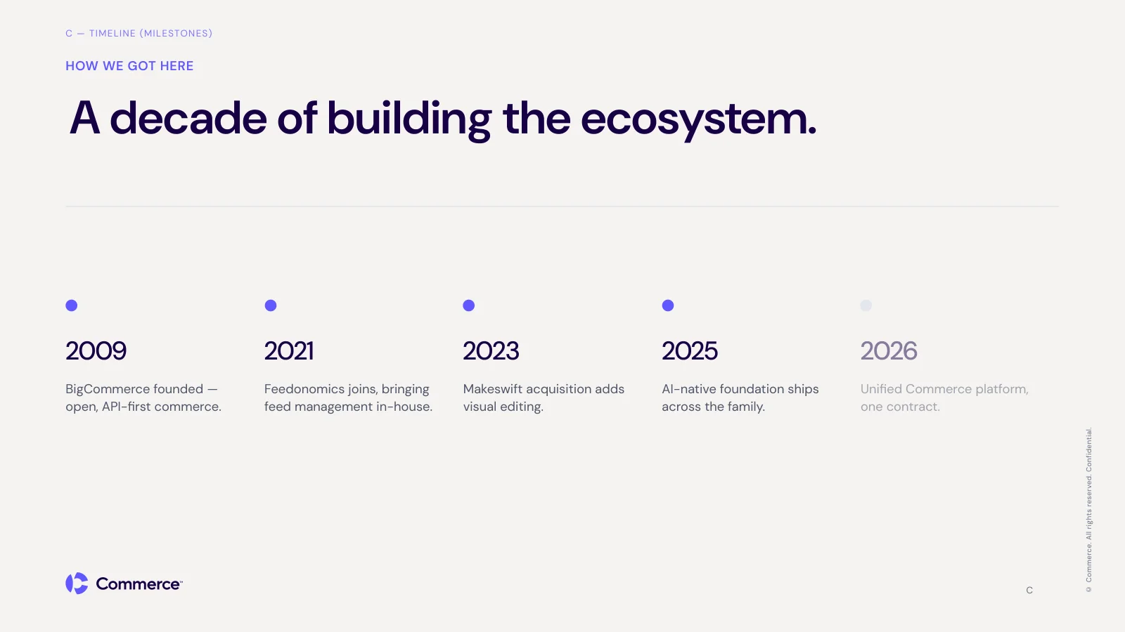
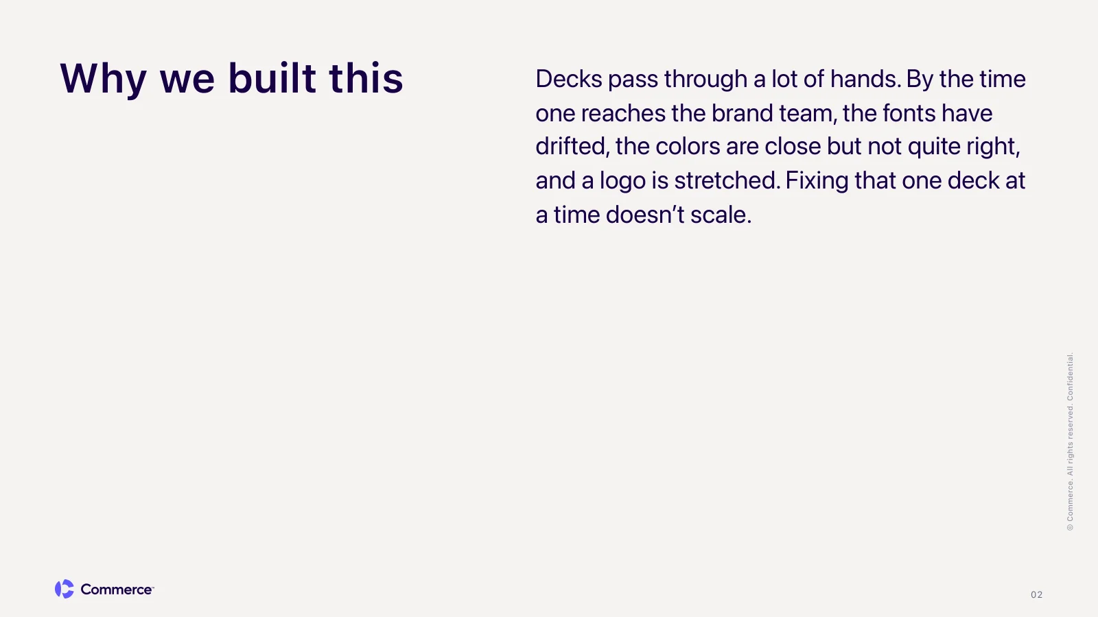
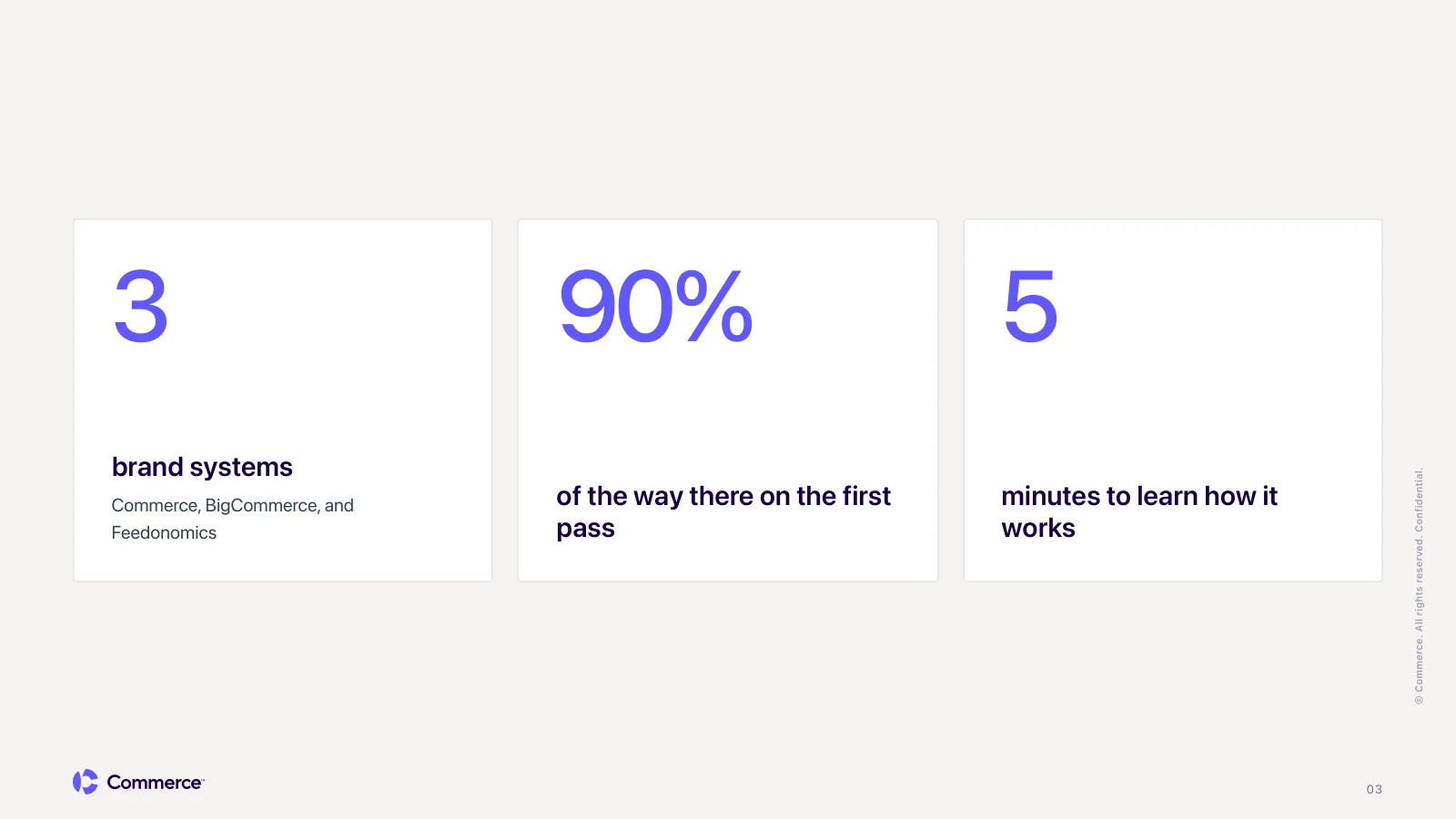
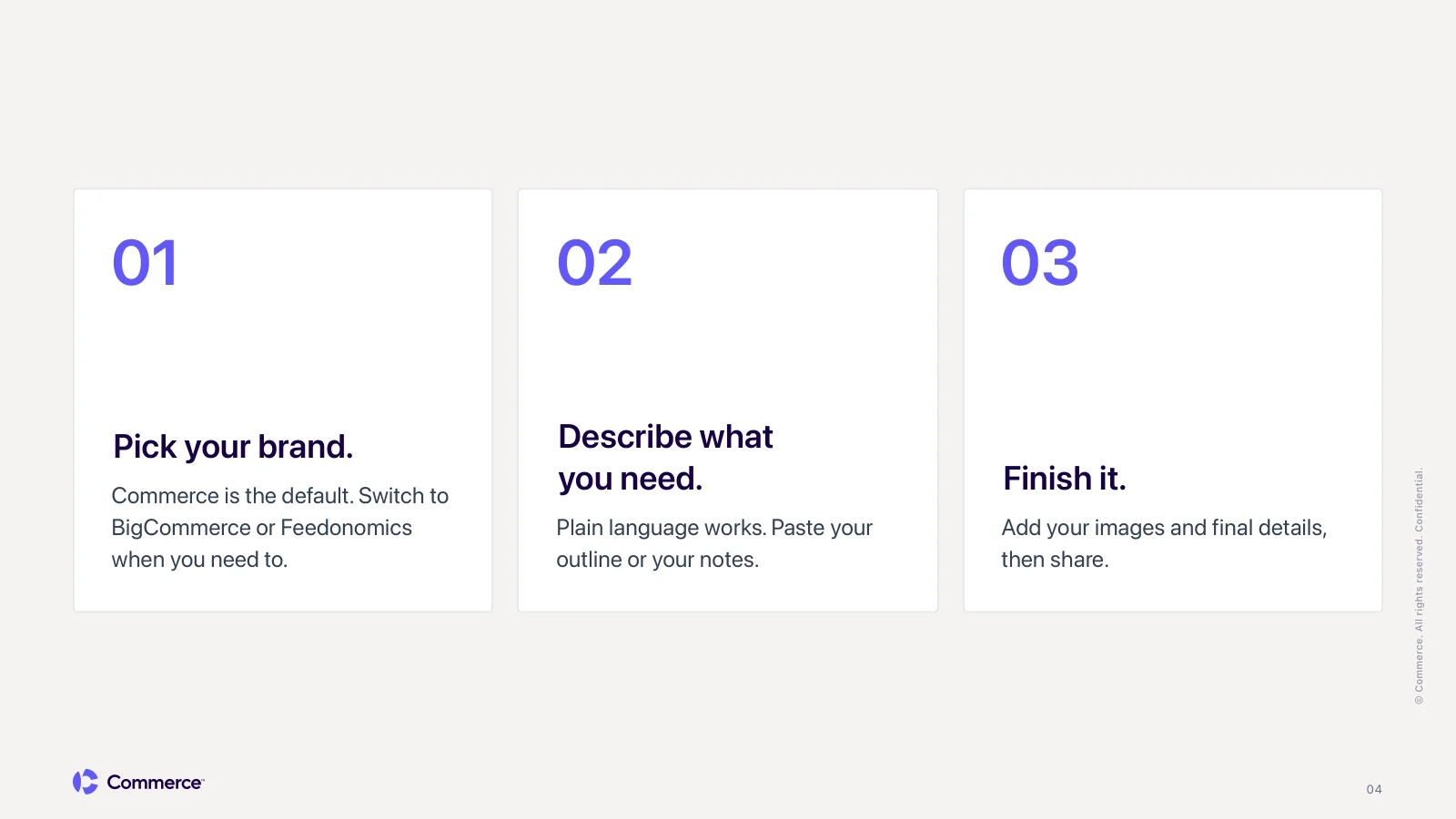
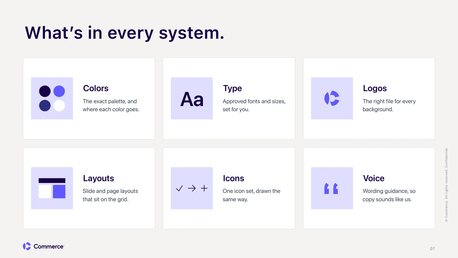
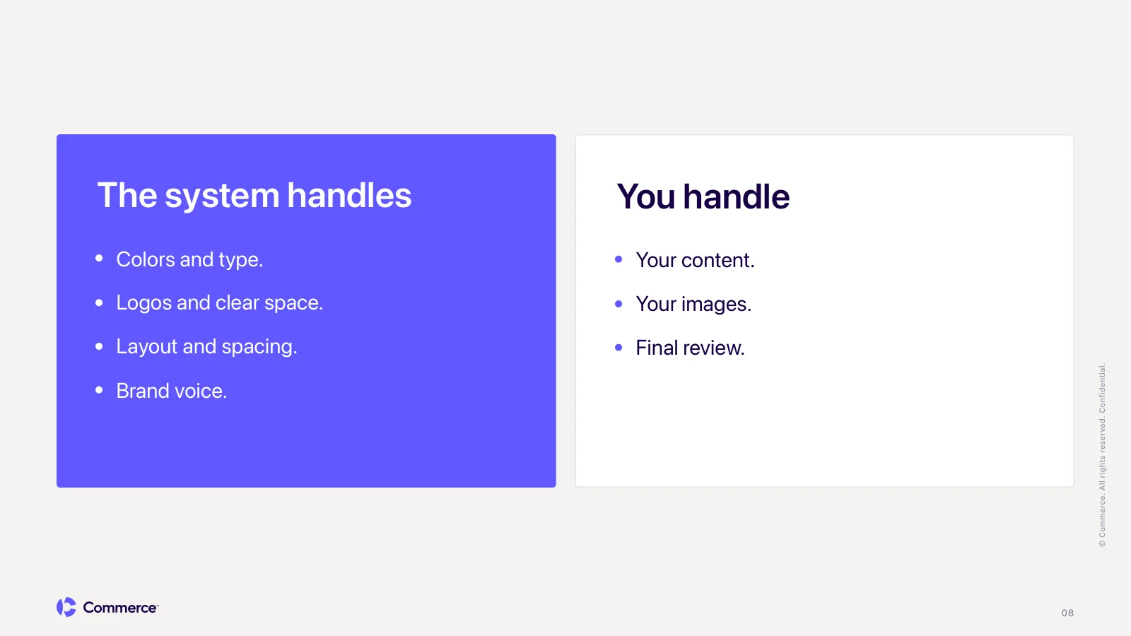
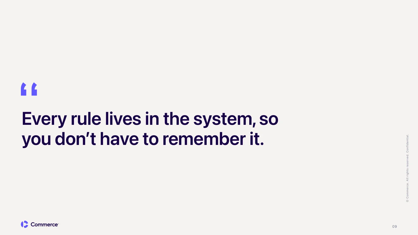
This is what came back. I named a few layouts, like stats and a big quote, and the system handled the rest. The content is nothing like the template deck above, but every slide follows the same rules:
- Logo placement. The Commerce logo sits in the same bottom-left spot on every content slide, with the same clear space.
- Page numbers. Always bottom right, same size, same color, and left off the cover.
- Legal line. "© Commerce. All rights reserved. Confidential." runs up the right edge of every slide.
- Type and spacing. Headlines, body copy, and cards share one type scale and the same margins from slide to slide.
- Color. Surfaces stay in the Commerce palette, and a row of stats shares one color.
That's the part that takes the load off the brand team. Anyone can write the notes. The system makes sure the result looks like Commerce.
The output
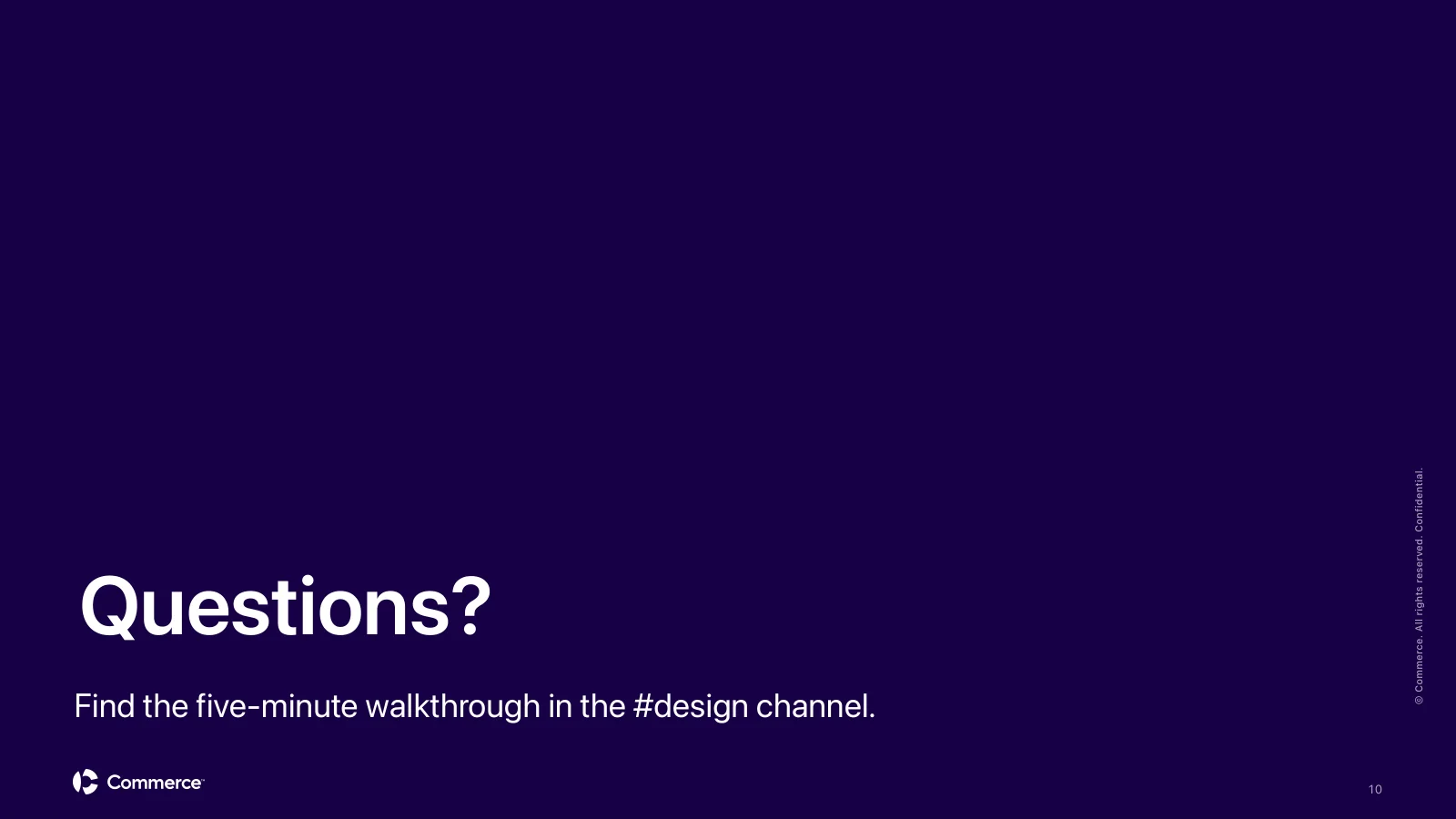
The deck the Commerce system built from that brief.
Templates for Repeat Work
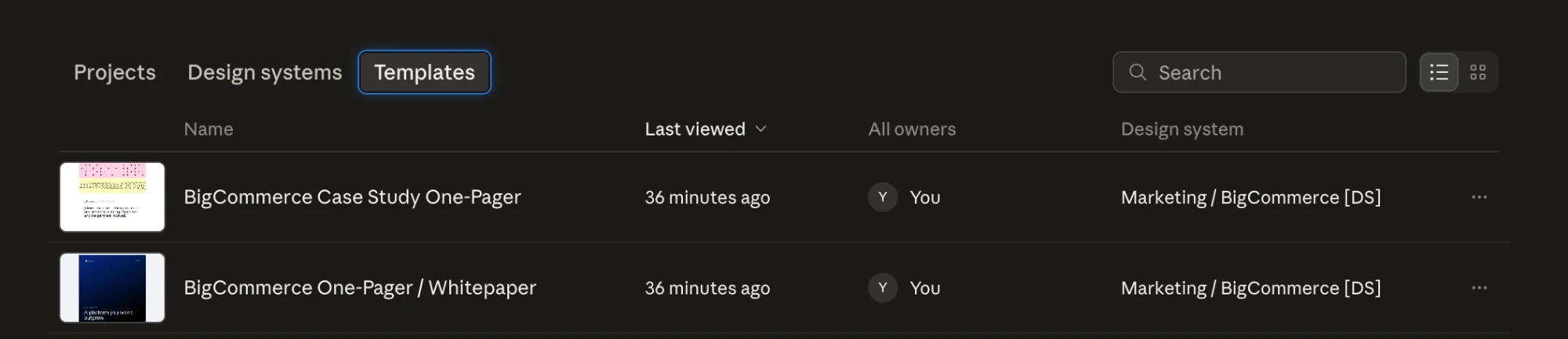
Some requests come in over and over with the same structure. For those, I build templates inside the system, so the layout rules are locked in and only the content changes. The BigCommerce system has a one-pager and whitepaper template and a case study one-pager. The case study template grew into its own project: a case study PDF system that replaced hand-built InDesign files.
Rules Written From Real Decks
Most of the rules in the deck systems exist because a deck went wrong. A logo got a vertical line and a tagline next to it. A row of cards got a different accent color on each one. Three stats came back in three different colors. Each time, the fix went into the system, not into one deck, so it never happened again.
The Commerce system goes one step further. It runs a check on every deck and flags anything that breaks a brand rule: an accent color used as a background, a logo without enough clear space, more than one highlighted phrase on a slide. Problems get caught before anyone on the brand team has to review them.
That's the part of design systems work that rarely makes it into a portfolio: the patient job of writing rules in response to failure. It's most of the actual craft.
Who Uses It for What
Not every asset carries the same risk. A rough wireframe that's slightly off costs nothing. A deck that's off brand in front of a customer can't. I worked through where the lines should sit with our creative director, who brought the view of how requests actually move through the creative team day to day. We decided based on stakes:
- Decks are self-serve. The slide system has tight enough structure to hold the brand on its own.
- One-pagers and PDFs go through design. The system handles the layout, and a designer finishes and reviews it. I wrote about that in the case study PDF system.
- Landing page wireframes start in Claude Design. It's quick at turning a brief into a page built from the brand's real sections, so the web team starts from a structure instead of a blank page.
Rolling It Out
A system only helps if people know it exists and trust it. I recorded a five-minute Loom that walks through what the systems are, how to start a deck, and how they fit into the way people already work. Because most of the people it's for aren't designers, the video skips tokens and components and focuses on the steps: pick your brand, describe what you need, add your images, share.
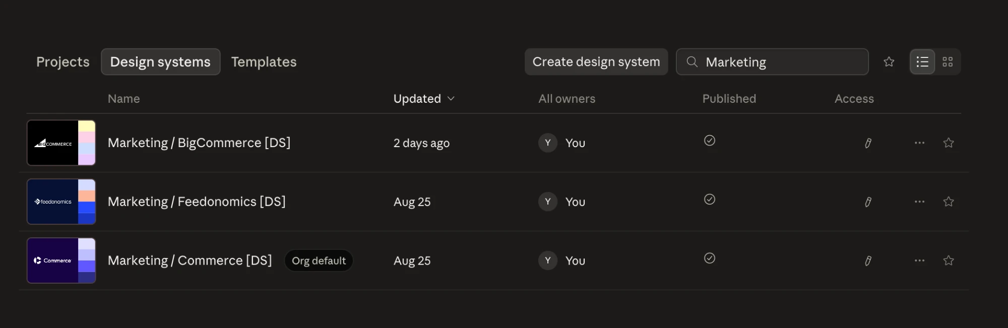
Commerce is set as the org default, so anyone who starts a new project in Claude Design lands on the parent brand unless they choose BigCommerce or Feedonomics.
What I Recommend
If you're building a design system in Claude Design, build it around the people who aren't designers. Start from real specs, not screenshots, so every system is built the same way. Give each brand its own system, because AI doesn't handle ambiguity well. Put every rule in the system instead of the prompt. And aim for 90%, not 100%. Letting people finish the last 10% themselves is what makes them want to use it.