Multi-brand Design System
One System for Three Brands
Commerce is the parent company behind BigCommerce, Feedonomics, and Makeswift, and each brand had its own Figma file, token library, and way of doing things. Over time, maintaining four separate systems became unsustainable. Designers were constantly using tokens from each file, mixing up color and type tokens per brand. They were inconsistently named, and there was no shared source of truth.
The goal was to consolidate all four into a single scalable design system that worked not just for designers, but for publishers, marketers, developers, and CRO specialists too. That mixed audience is what made this genuinely hard to get right.
Built Around How People Actually Work
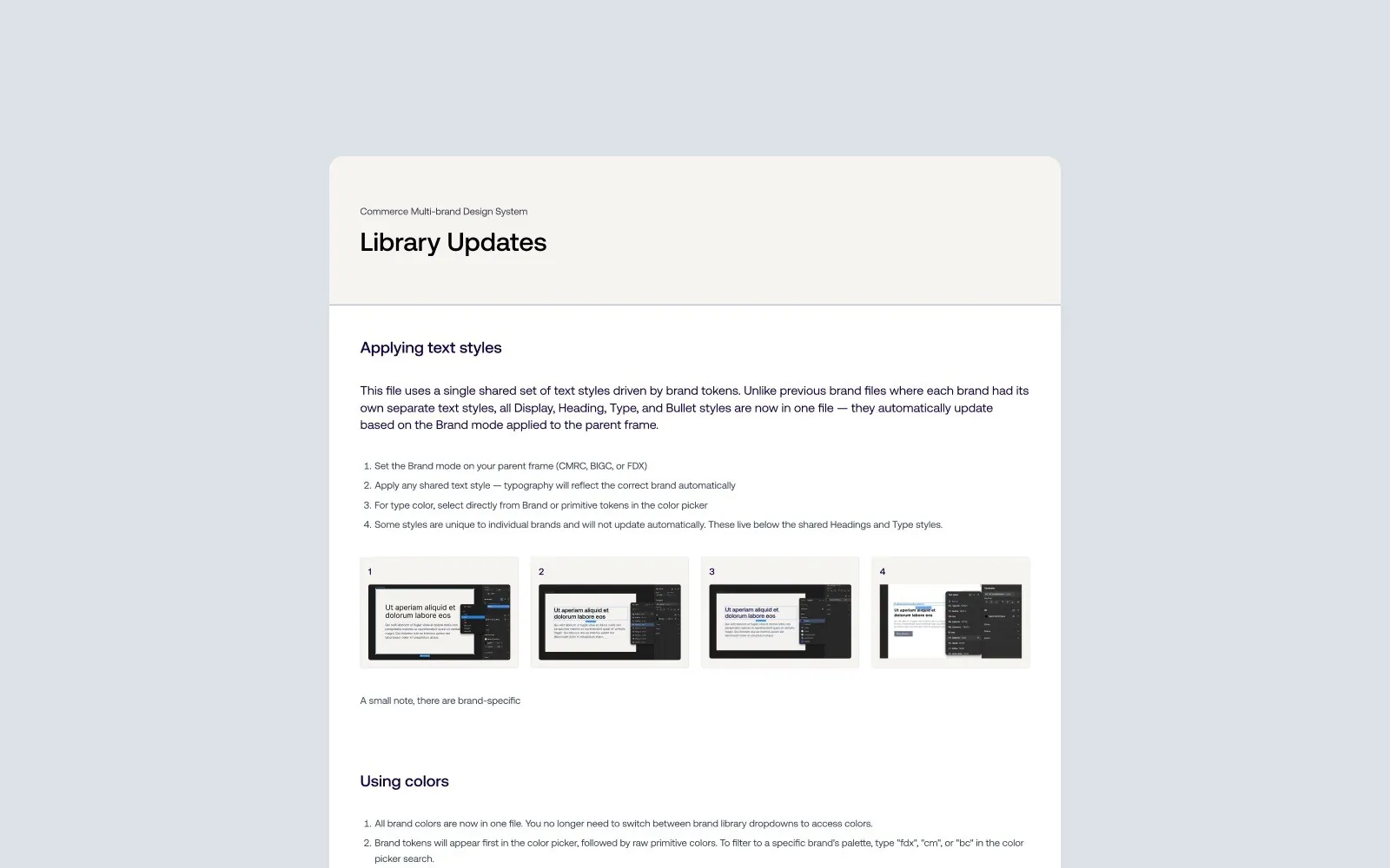
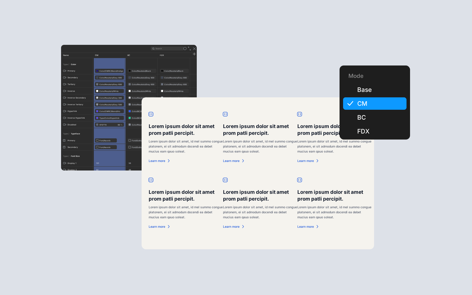
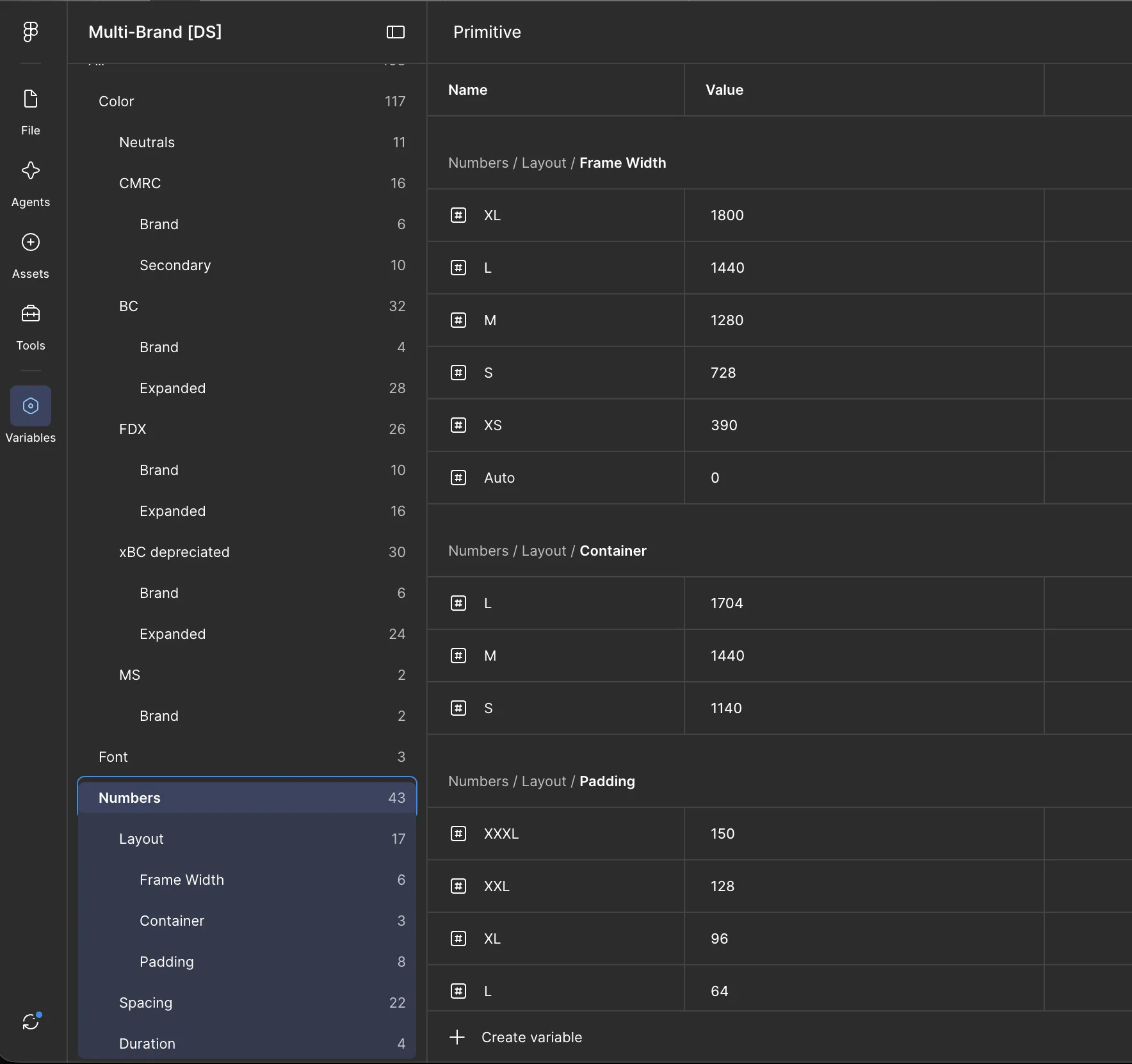
Rather than normalizing everything into one watered-down middle ground, the system reflects how each brand actually exists on its live sites. The foundation is a four-collection variable architecture covering primitive, brand, and theme tokens across all three brands and their mobile counterparts. The hardest part of getting there was making color and type tokens work seamlessly across all of them. Matching display, heading, body, quote, and eyebrow styles across brands so that a single text style pulls cleanly from tokens sounds straightforward, but getting that to feel right and stay maintainable took real work.
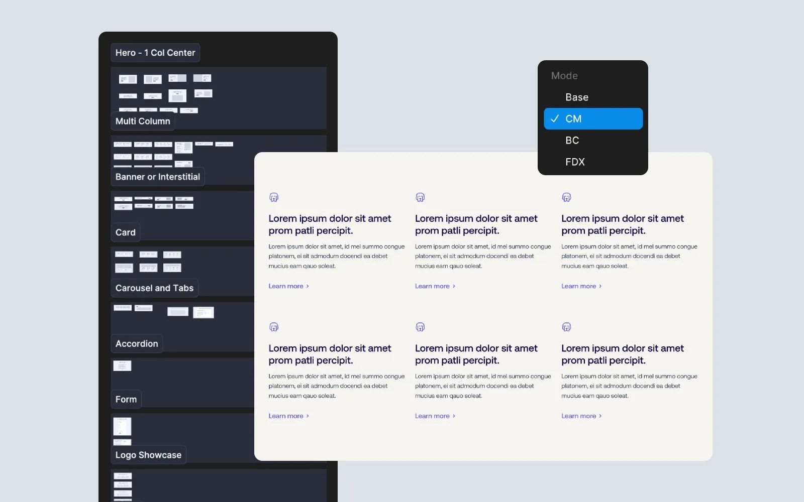
With the token system solid, sections came together in a way that kept the whole thing accessible to everyone who touches it. The goal was always finding the balance between being as easy as possible for non-designers and as powerful as possible for web designers. Drop a hero section, set the brand on the outer frame, and typography, spacing, and surface colors all update automatically with no token knowledge required. The final file includes 131 primitive variables, 115 brand variables across 6 modes, and a full library of sections and components spanning heroes, carousels, accordions, CTAs, feature layouts, and more.
One Token Name, a Value per Brand
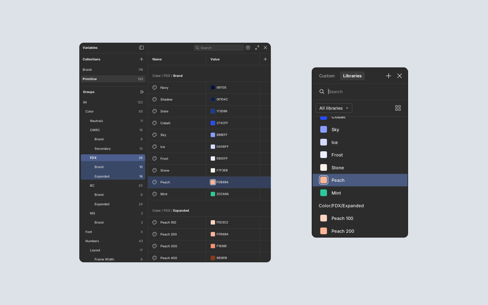
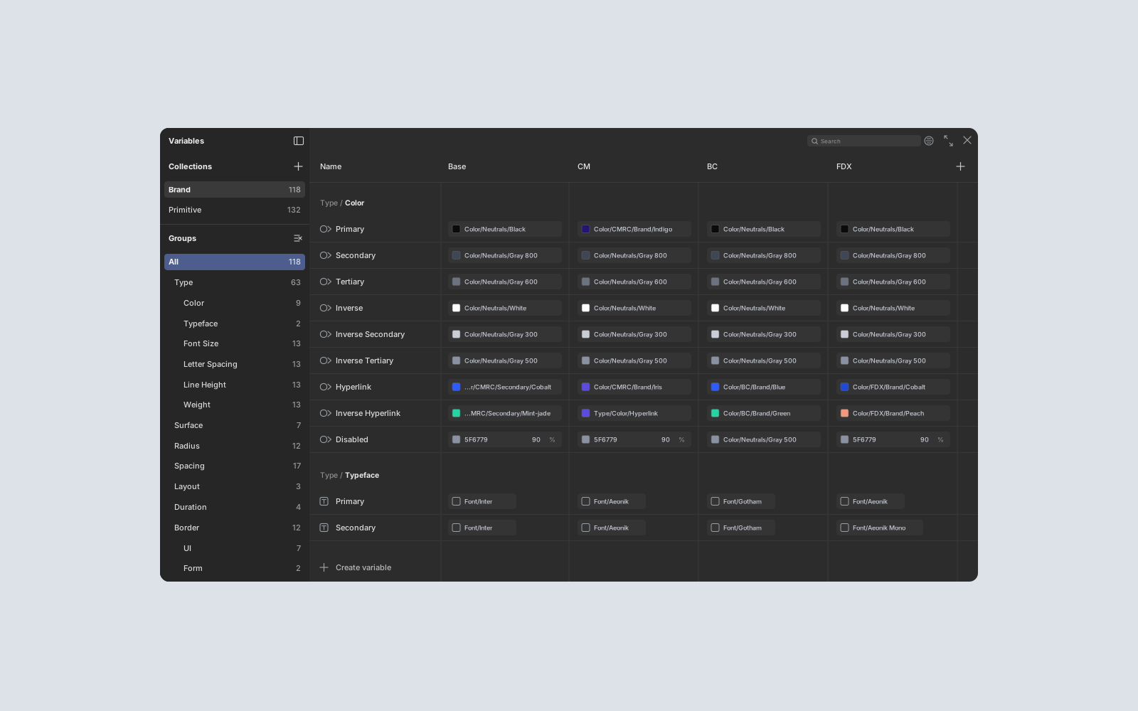
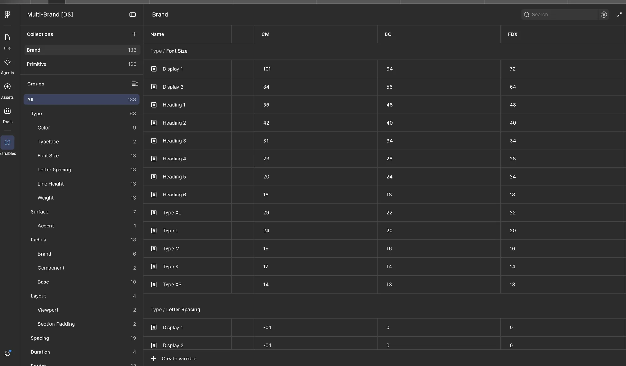
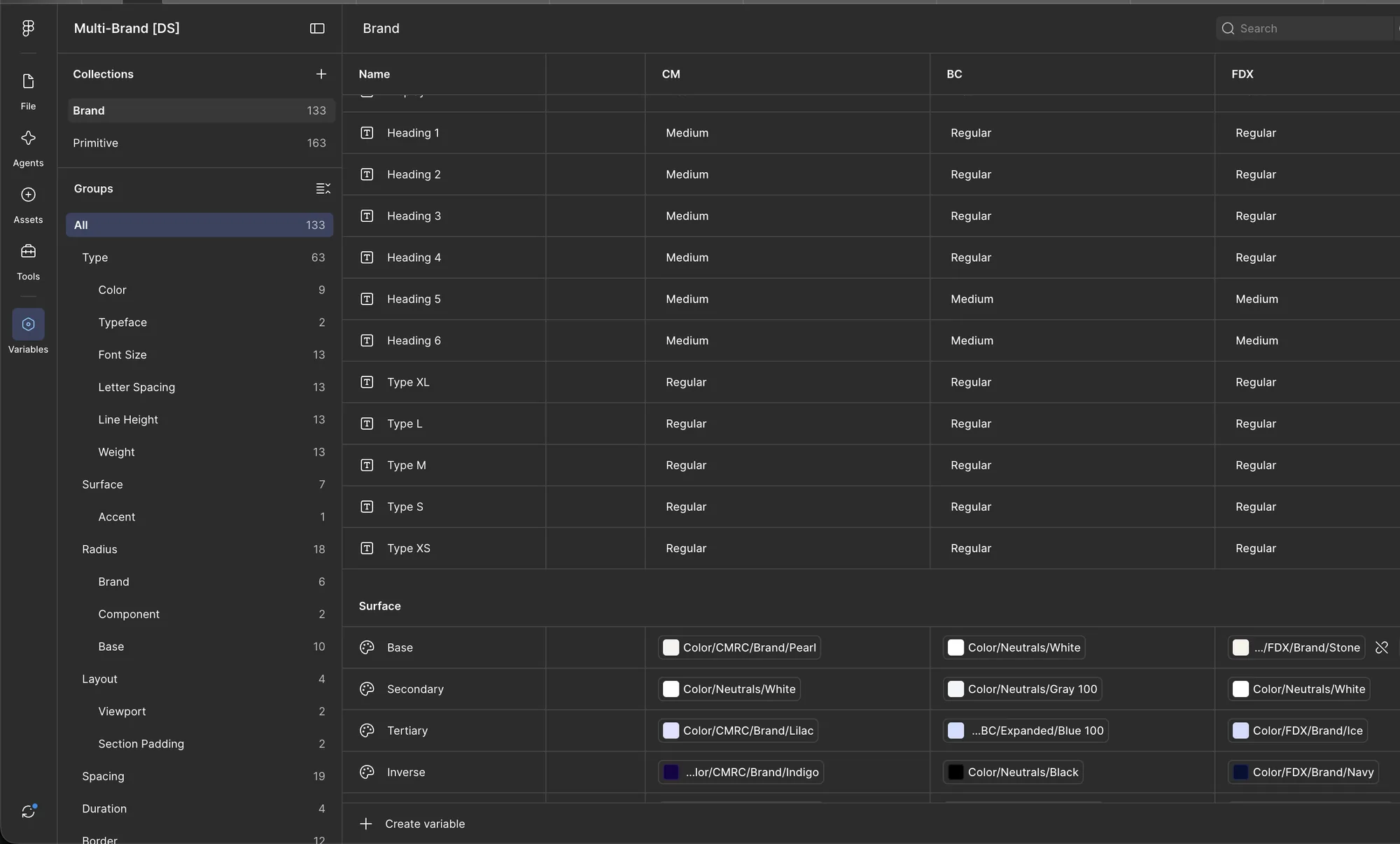
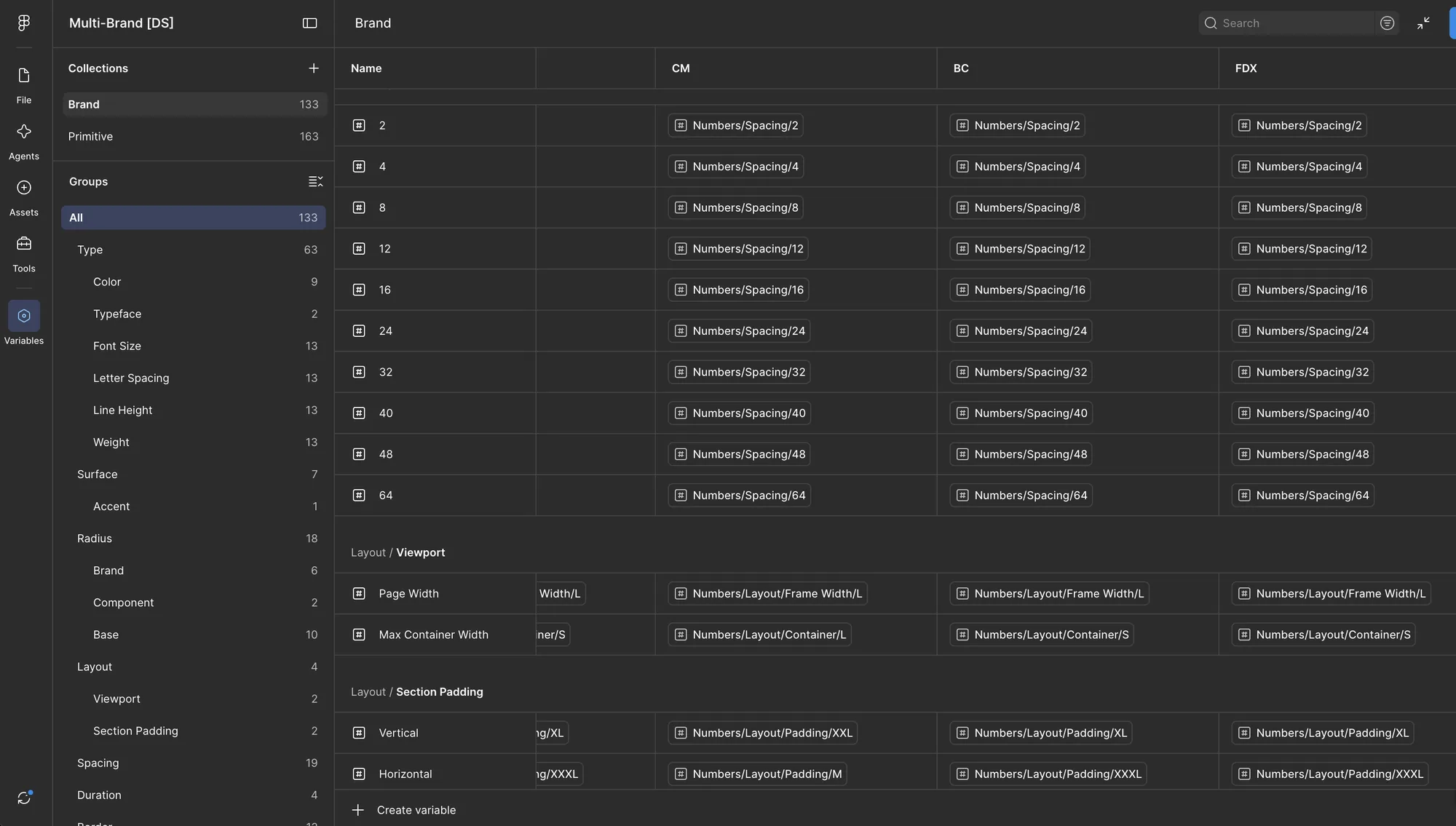
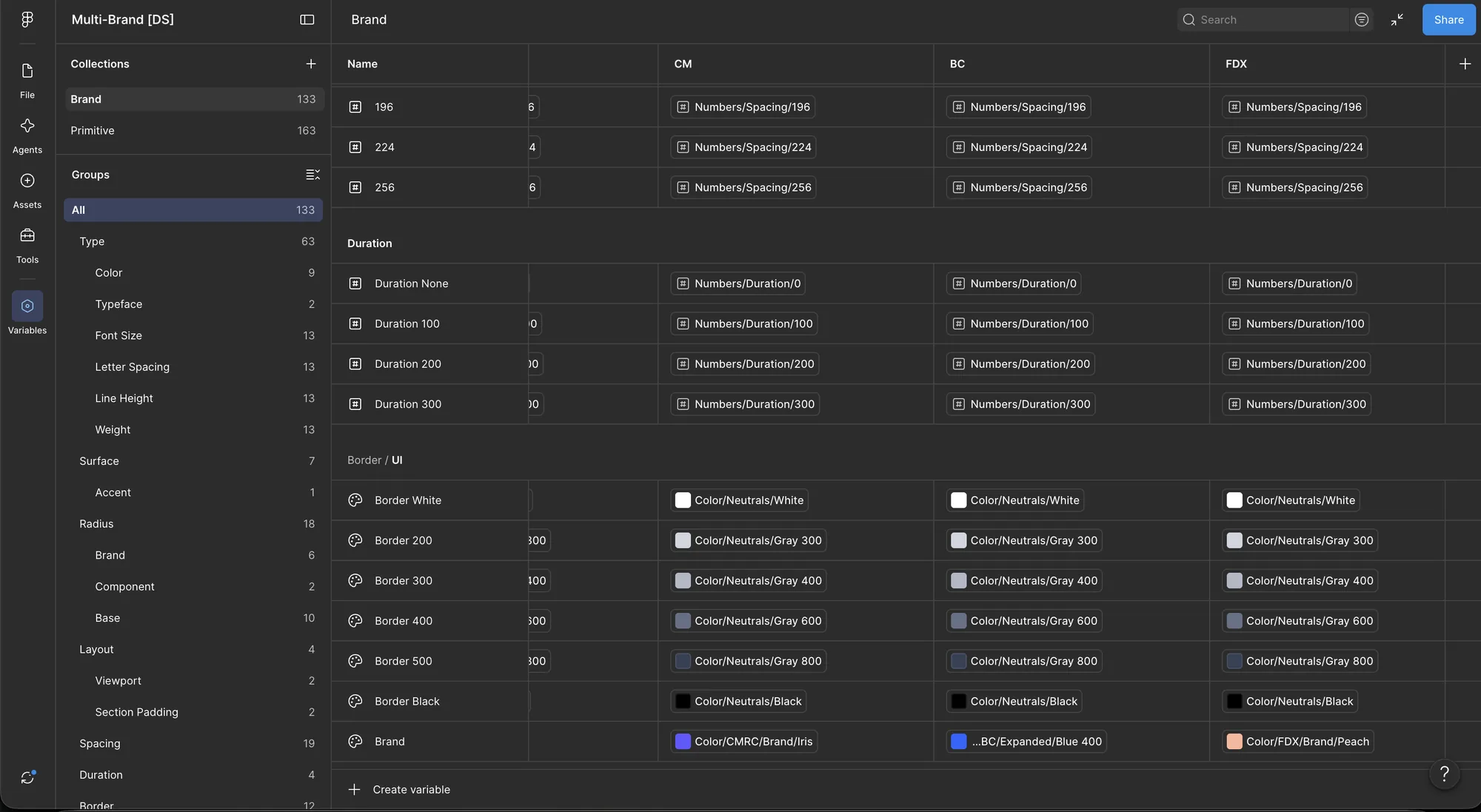
The variables split into two collections. Primitives hold the raw values: every brand's color ramps, the fonts, and shared number scales for frame widths, containers, padding, spacing, and motion. Brand tokens give those values a job, and each one carries a column for Commerce (CM), BigCommerce (BC), and Feedonomics (FDX).
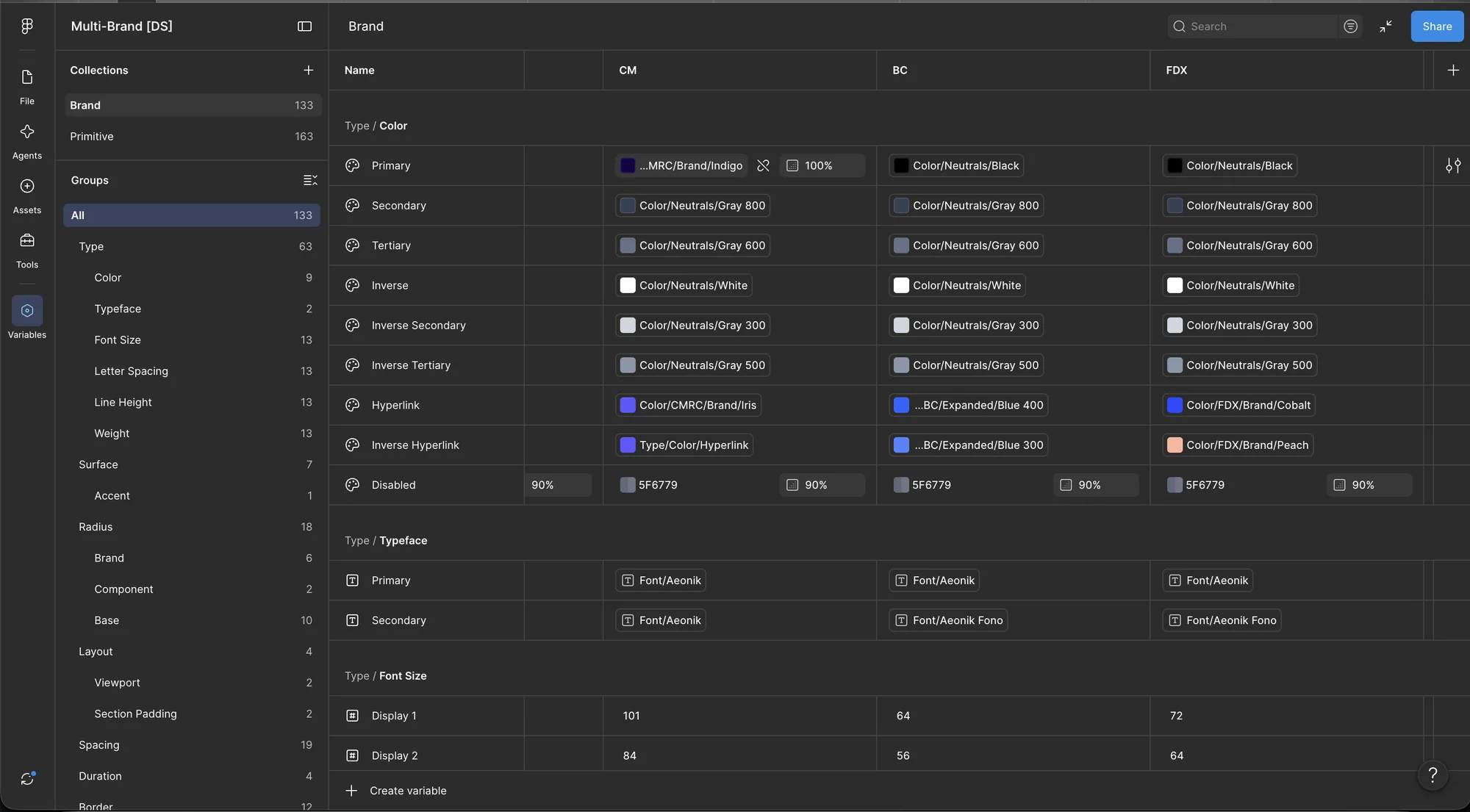
That's what lets one component serve every brand. Display 1 is 101px for Commerce, 64 for BigCommerce, and 72 for Feedonomics. Surface/Base is Pearl, White, or Stone. Hyperlink is Iris, Blue 400, or Cobalt. Where the brands agree, like the spacing scale and motion timing, all three columns point at the same primitive, so a change lands everywhere at once.
Set the Brand Once
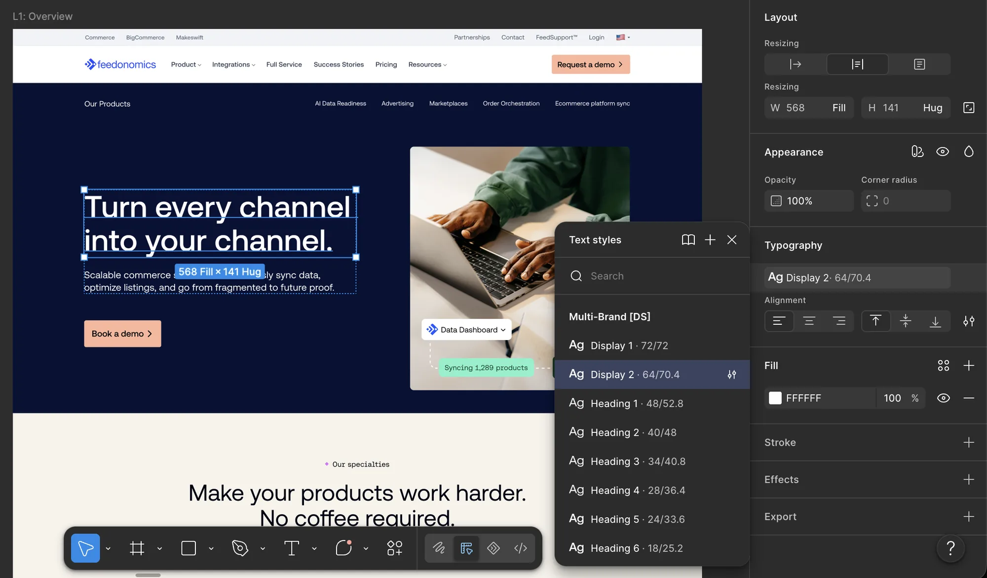
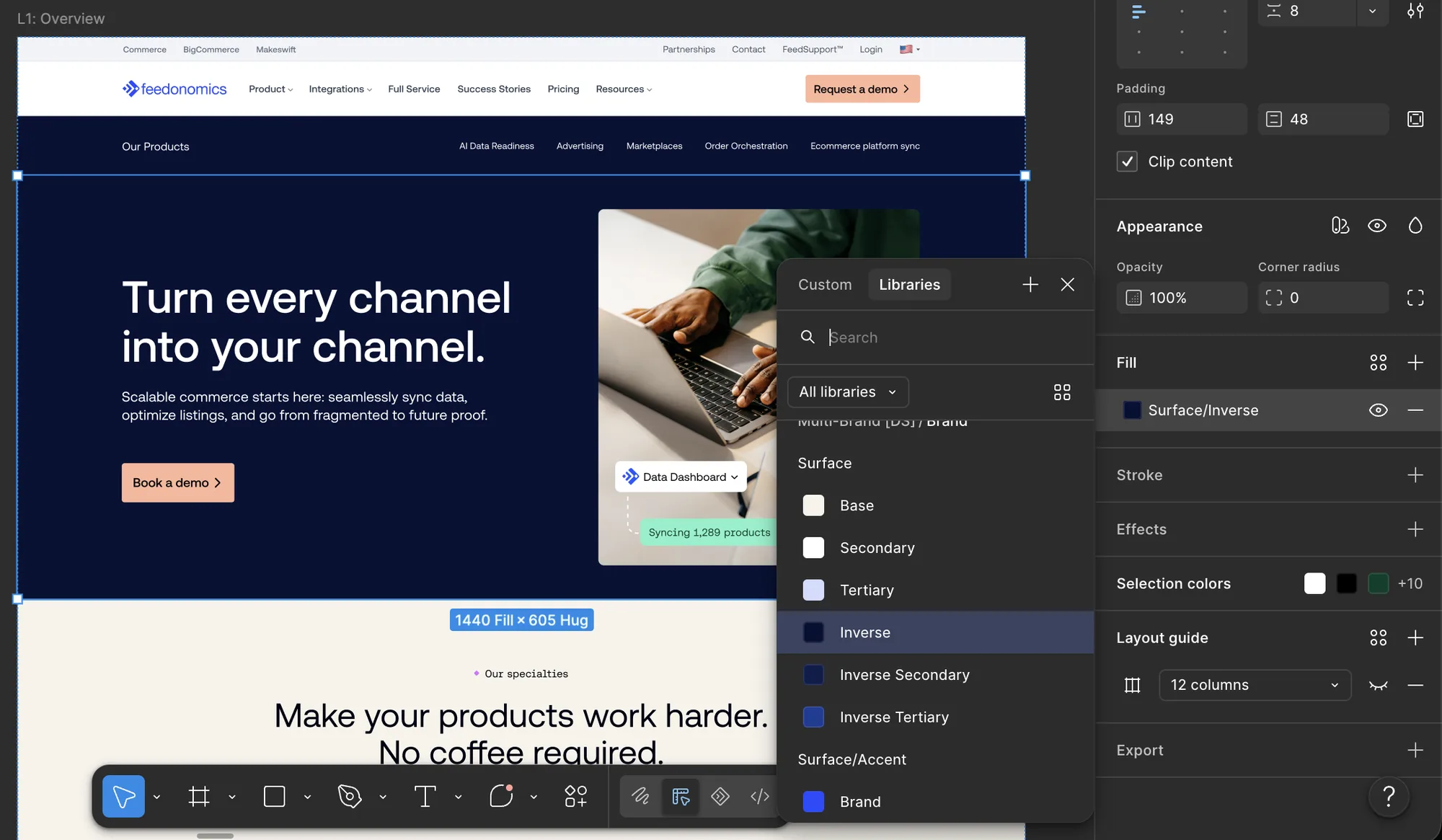
In practice, a designer sets the brand on the page and then only picks shared styles and tokens. On a Feedonomics page, the hero headline uses Display 2 from the Multi-Brand text styles and resolves to 64/70.4. The hero section is filled with Surface/Inverse, which is Navy for Feedonomics. Neither one has a hex value or a brand-specific style attached.