Feedonomics Rebrand & Design System
The Project
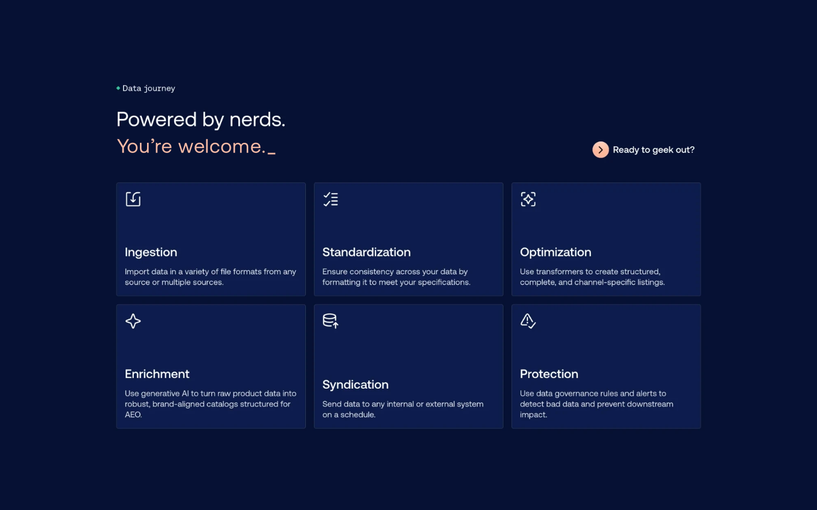
Feedonomics is one of three brands under Commerce, alongside BigCommerce and Makeswift. What started as a brand refresh turned into a full rebrand over six months. Everything but the logo changed, and the site moved to Makeswift for page building and Contentful for content, the same setup BigCommerce already used.
I led the design system. That meant turning the new brand into tokens, type, spacing, and components that developers could build and publishers could use long after launch.
Here is what this covers:
- Feedonomics tokens in Figma and Makeswift, and how pages use them
- Component documentation for developers
- The review process with developers, web publishing, and SEO
- The resources section, before and after
- What I recommend

The Team
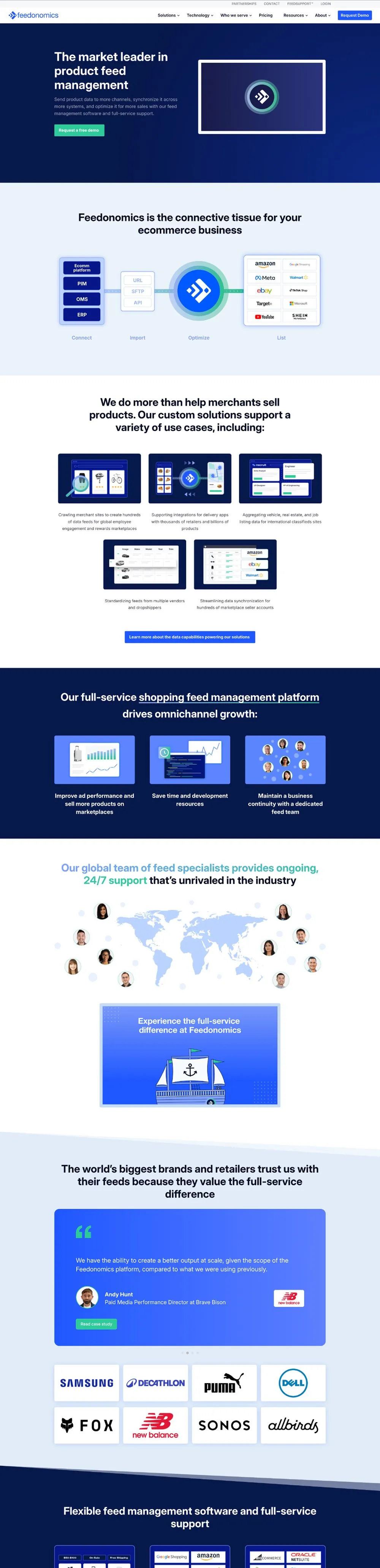
Four of us did this work. Rob Rodriguez led brand and art direction: color, gradients, type pairing, and brand graphics. Sydney Bonner, our copywriter, was the brains behind the brand's tone and voice. She moved the homepage from "The market leader in product feed management" to "Go from invisible to everywhere," and her copy guidelines set the rules: lead with benefits instead of features, write for everyone from executives to engineers, and sound like clever, confident feed nerds. Lines like "Make your products work harder. No coffee required." came from her. Juan Roque, our senior web designer, designed and built most of the pages. I owned the design system: the Feedonomics tokens in our multi-brand Figma library, the component specs, and the build in Makeswift.
We leaned on each other the whole way. Rob's brand decisions became tokens I could name and hand to developers. Juan's pages tested each component before it went to development, and a lot of his feedback is in the review doc. By the second half of the project, I was working with our developers almost every day, turning specs into real components.
The Goals
Before building anything, I wrote down what the system had to do:
- One source of truth. Feedonomics tokens live in the same Figma library as Commerce and BigCommerce.
- Tokens do the styling. Set the brand, pick a surface, and type, color, and spacing follow. No hex values typed into pages.
- Specs answer the questions. Every component documents its layout, states, motion, and breakpoints.
- Publishers can build pages on their own. A short list of Makeswift settings, clear names, and good defaults.
- Three sign-offs. Design, web publishing, and SEO approve every component.
Tokens First
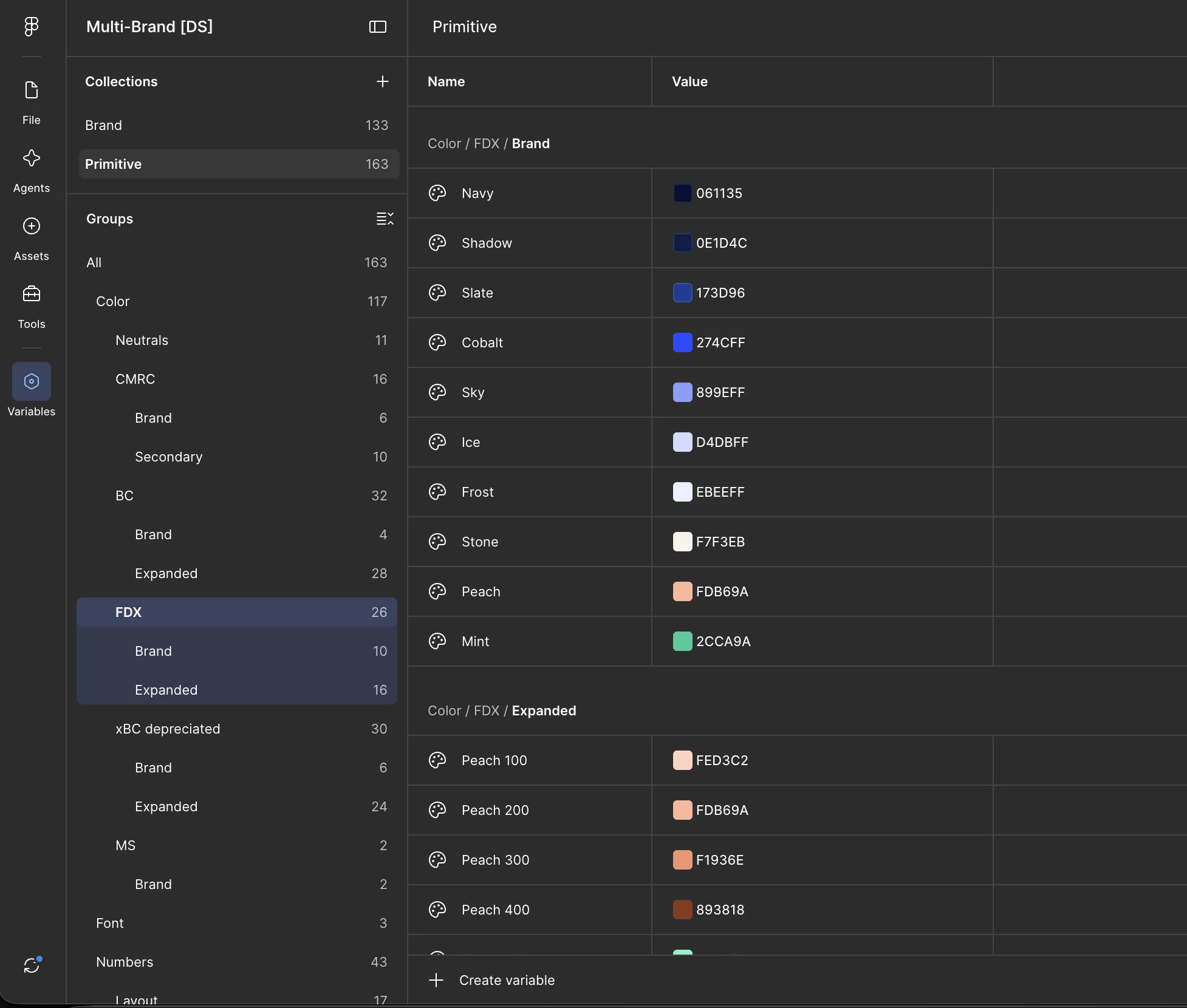
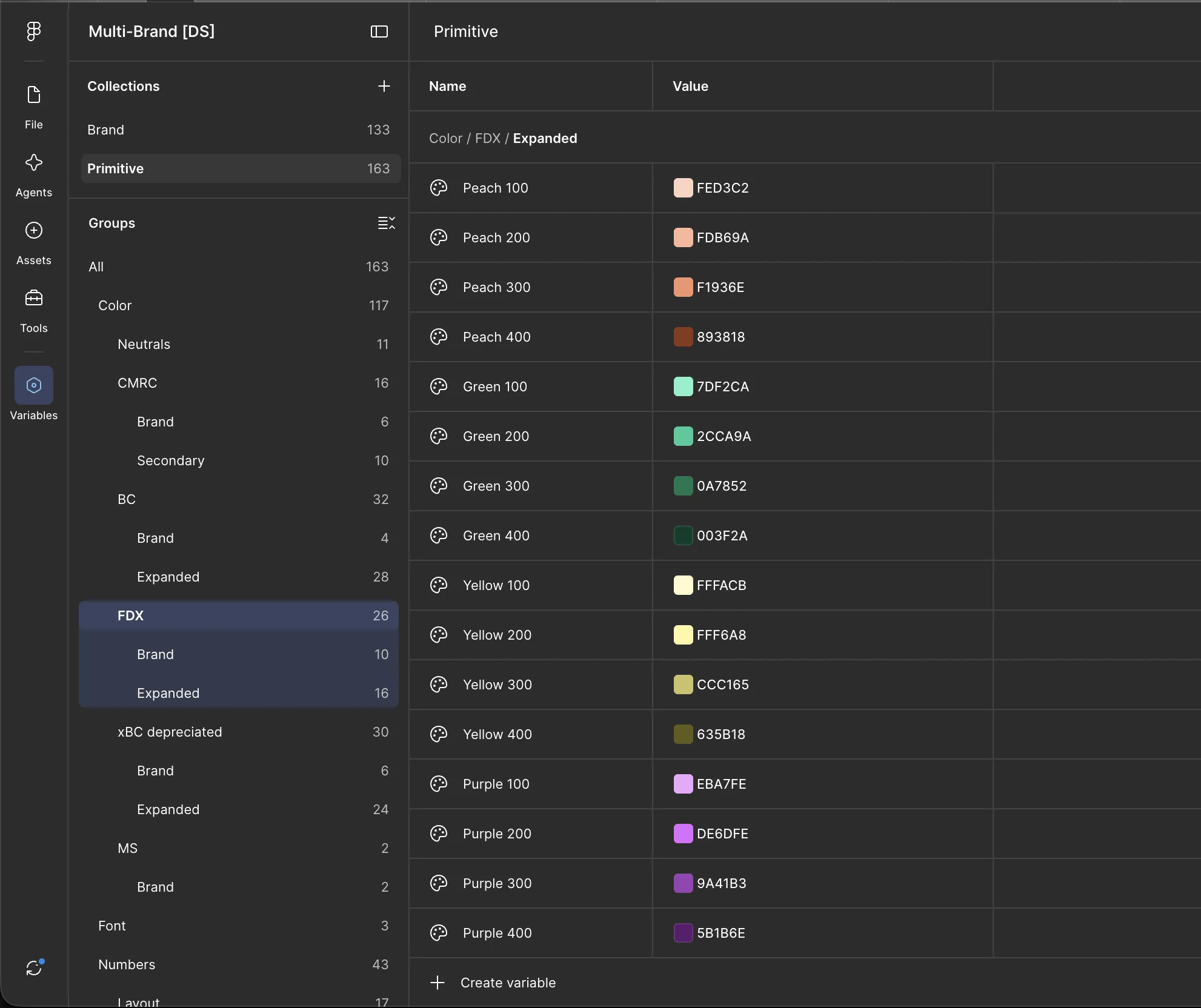
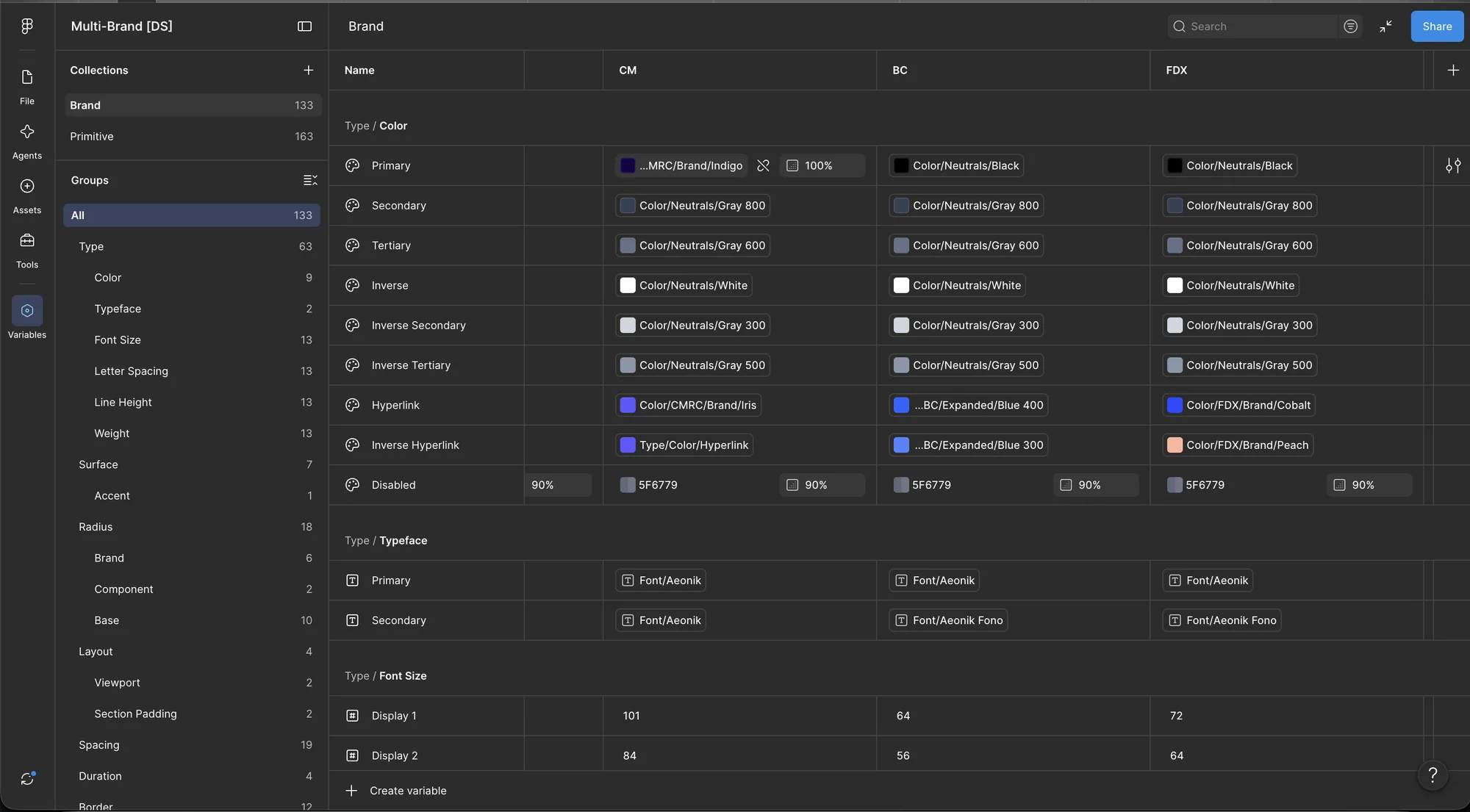
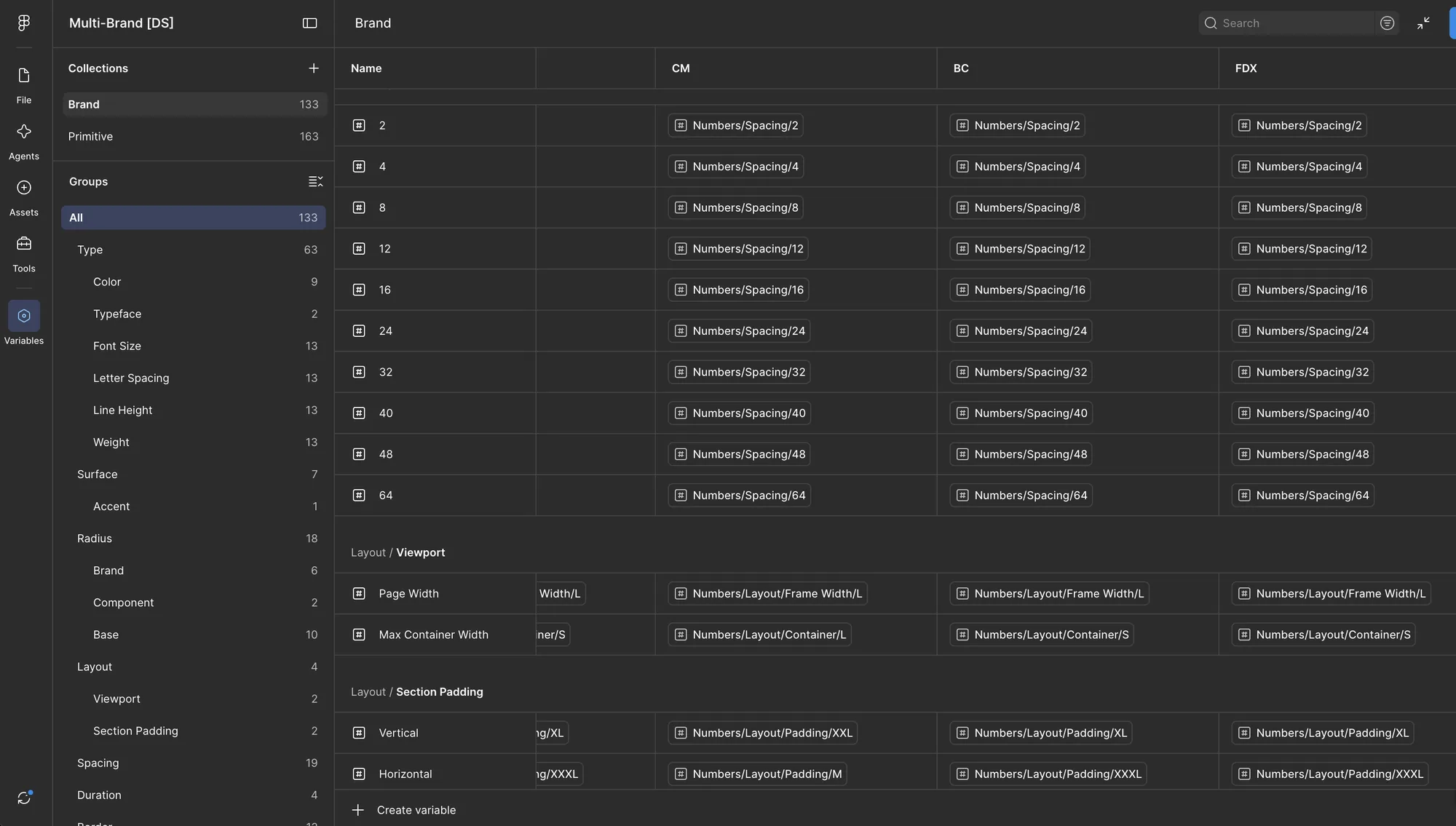
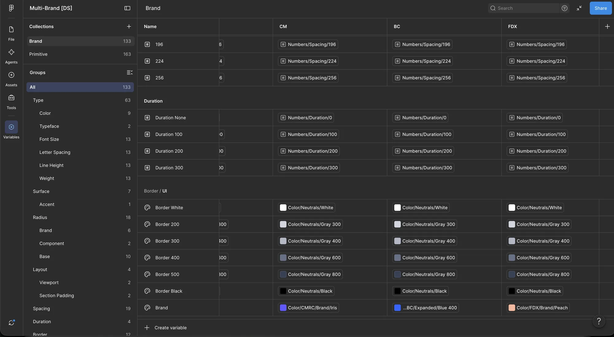
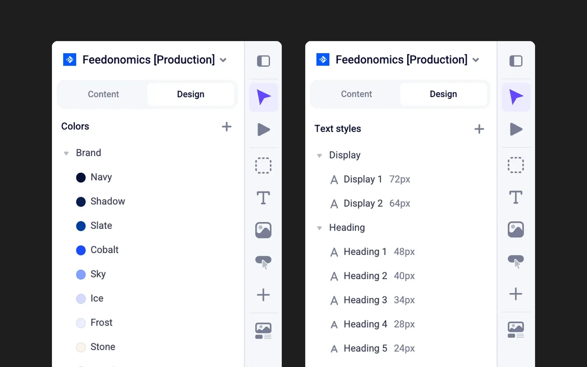
Rob's brand work came to me as colors, type, and art direction. I turned it into Figma variables in our multi-brand library, next to Commerce and BigCommerce, with the same names and structure. That way a component built once works for all three brands.
The tokens come in two layers:
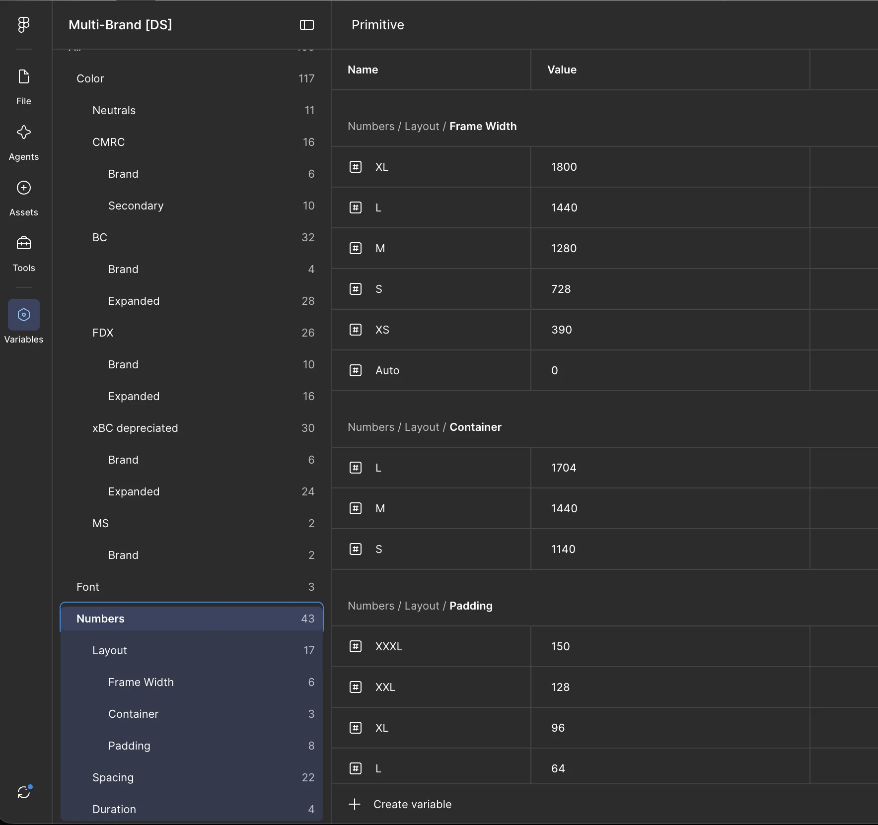
- Primitives are the raw values: 26 Feedonomics colors (10 brand colors and 16 more in Peach, Green, Yellow, and Purple ramps), plus number scales for widths, padding, spacing, and animation timing.
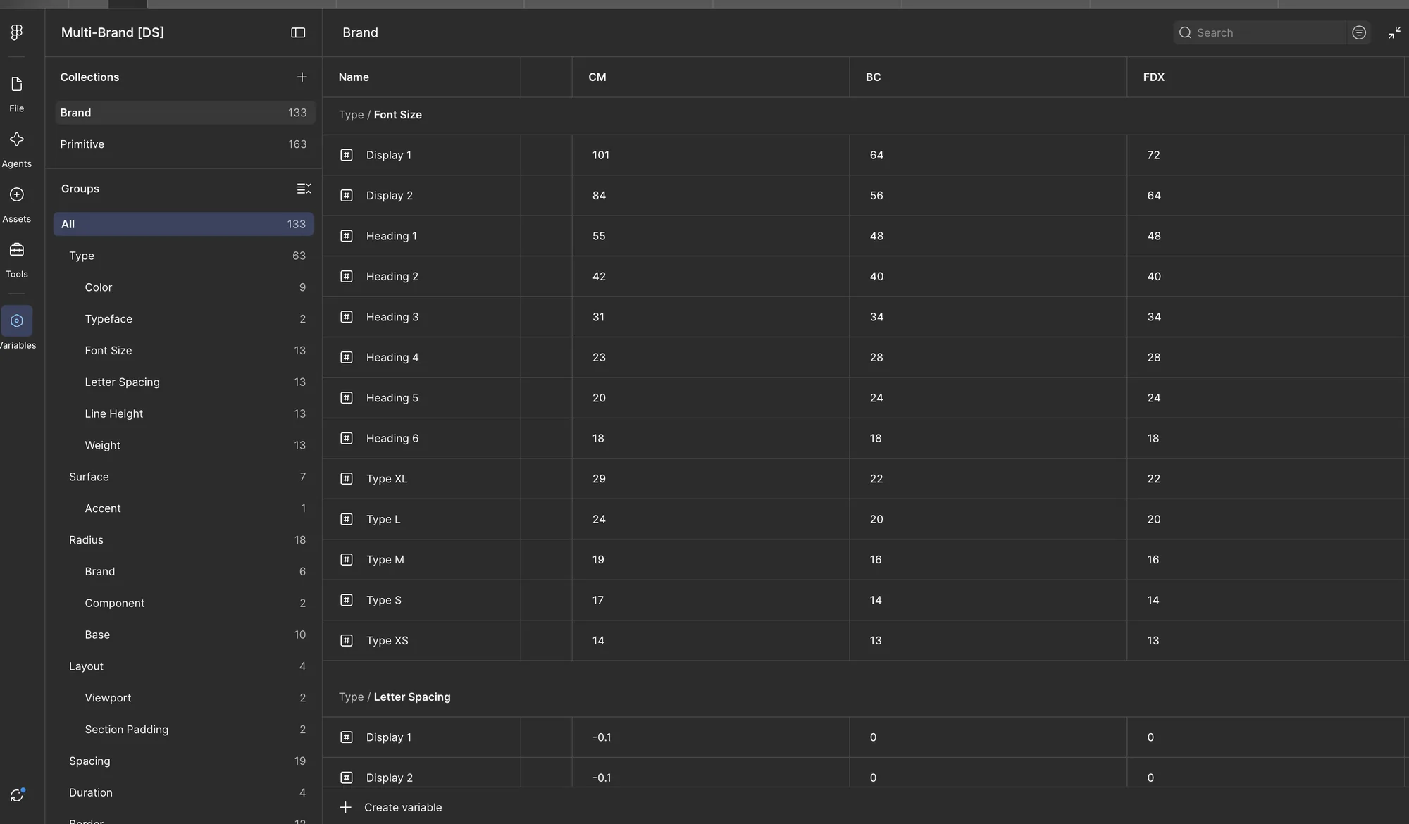
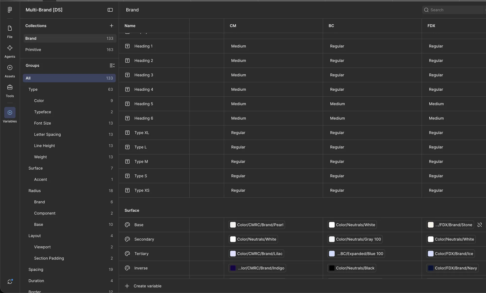
- Brand tokens give those values a job: text color, font, size, line height, weight, surface, radius, borders, and padding. Each has a value for Commerce, BigCommerce, and Feedonomics, plus mobile.
Components only use brand tokens. A section uses Surface/Inverse, not Navy. So switching a component from BigCommerce to Feedonomics is one setting.
Tokens Applied to the Page
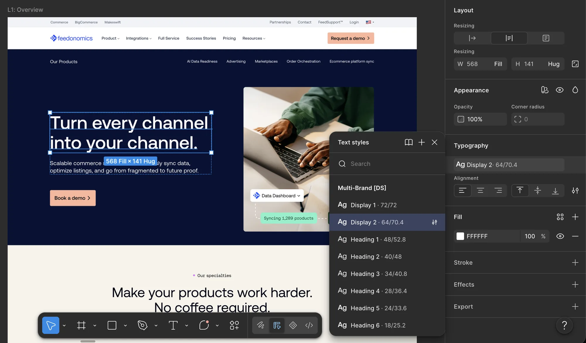
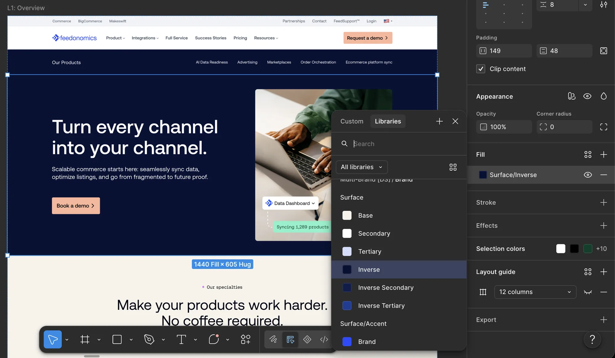
In the Feedonomics page files, each page is set to the FDX brand once. After that, designers pick shared text styles and surface tokens, and the Feedonomics values fill in.
- Type. A hero headline uses Display 2, which is 64/70.4 for Feedonomics. The same style gives BigCommerce its own size and gets smaller on mobile.
- Surface. Sections use surface tokens instead of colors: Base (Stone), Secondary (White), and Tertiary (Ice) for light sections, and three Inverse tokens for the navy ones.
- Spacing. On desktop, a 1440px frame, 1140px content width, 150px side padding, and 96px top and bottom. On mobile, a 390px frame with 24px and 64px.
Makeswift doesn't connect to Figma. There's no sync and no MCP, so I built the same color and type tokens by hand in both, with matching names. Designers and publishers can check either one and get the same values.
A Kitchen Sink for Publishers
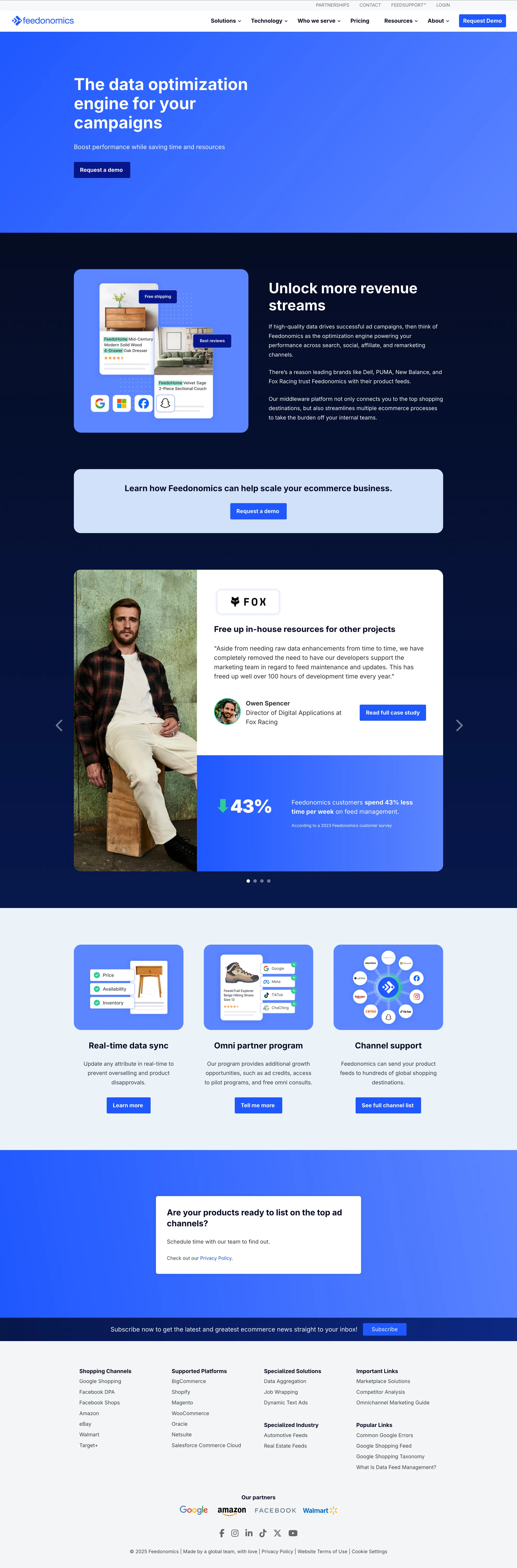
Tokens alone don't build pages. In Makeswift I also built what we call the kitchen sink: about 50 ready-made sections, including heroes, multi-column layouts, forms, and stats blocks, all using the same tokens and spacing as Figma. Publishers pick a section, drop in their content, and don't need a designer to lay out the page.
Documentation for Developers
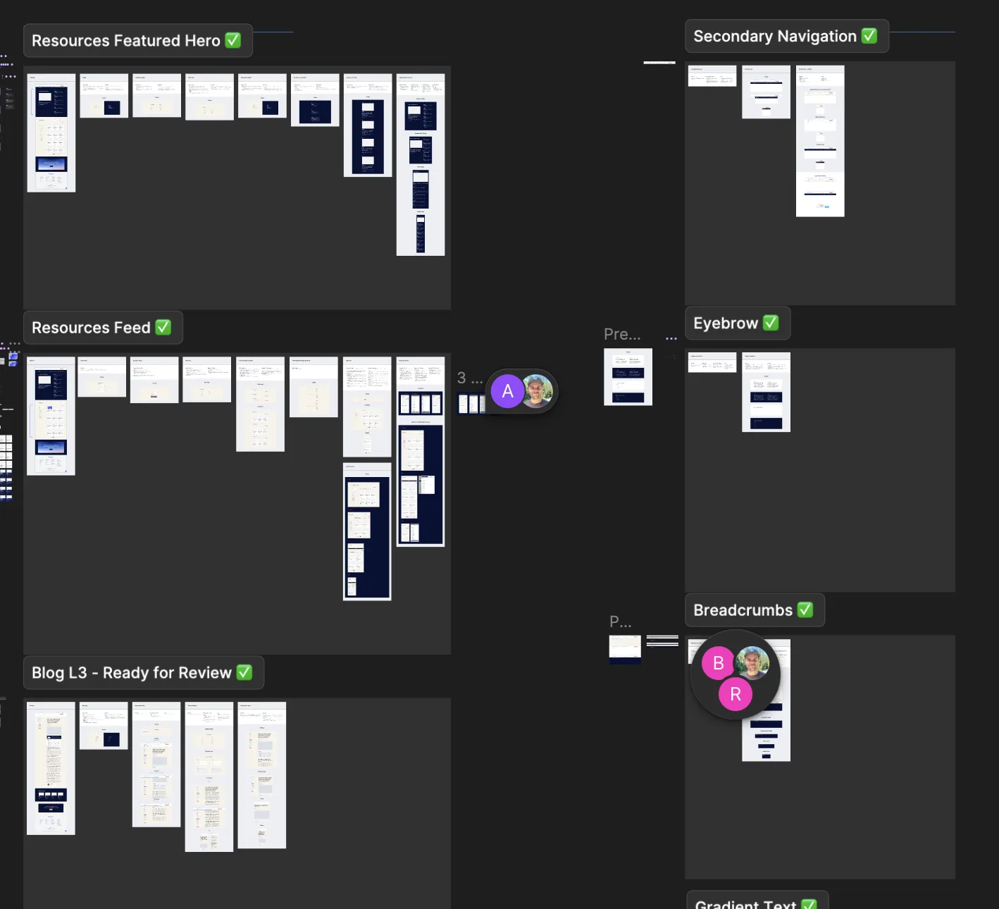
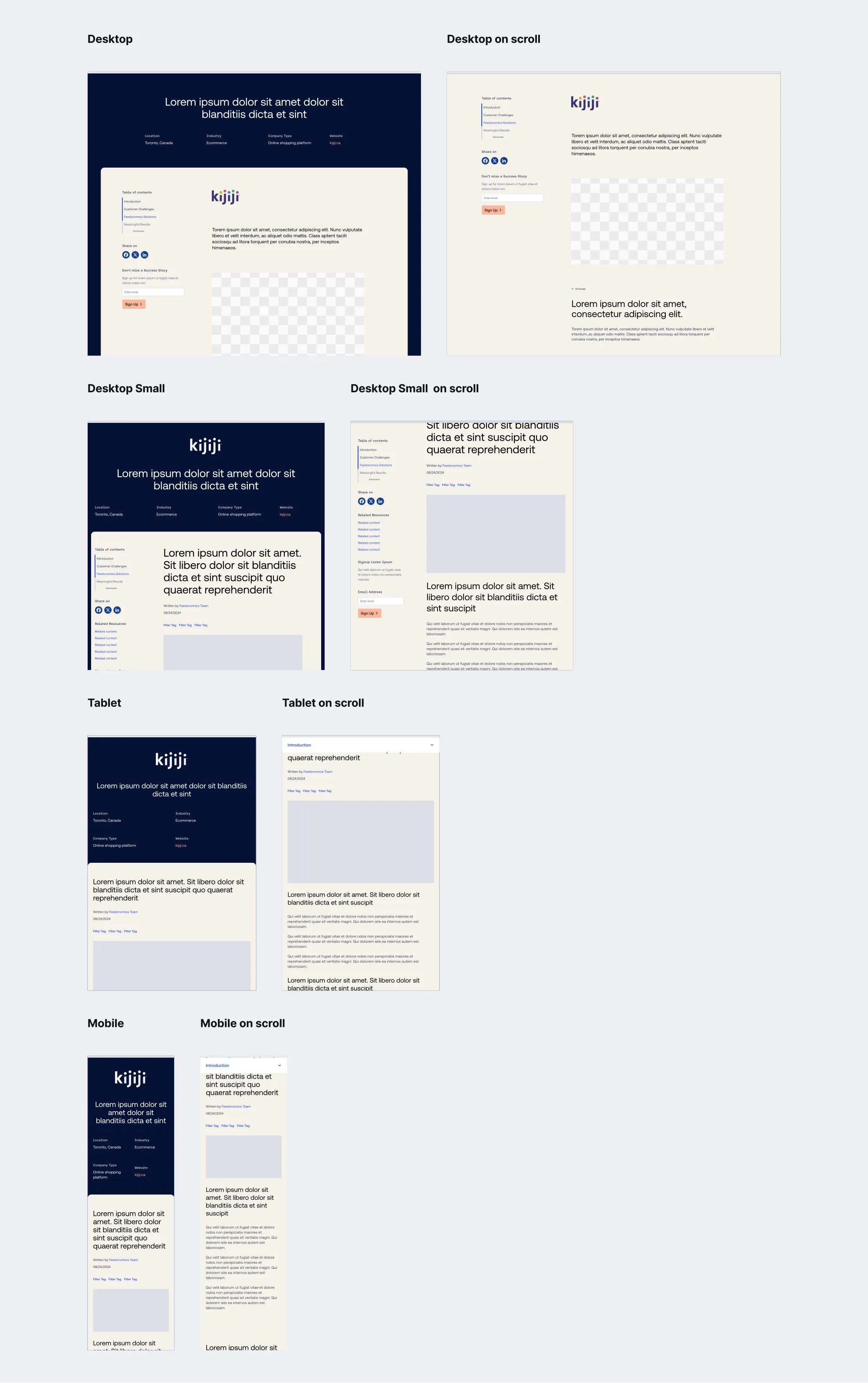
Every component and page template has a documentation frame in the Figma file, with its status in the label: Ready for Review, Ready for Dev, or approved. Developers could always tell what was safe to build.
Each spec covers the same things:
- Content rules. What's required, what's optional, and what happens when something is missing.
- States and motion. Hover, press, and focus, with timing. For example, the primary button's corners and inner glow share one 300ms ease.
- Breakpoints. Desktop, small desktop, tablet, and mobile. Long pages like success stories also show scrolling: the sticky table of contents on desktop turns into a dropdown on smaller screens.
- Makeswift settings. What publishers can change, what each setting is called, and its default.
The Review Process
The FDX Component Review is the doc where we worked through every component with developers. It has a tab for each of the nearly 40 components and page templates, and each one moved through the same statuses: not started, in review, in development, and approved. Approved meant design, web publishing, and SEO had all signed off.
Each tab links to the Makeswift test page and sorts feedback by topic, with a name on every note and a checkmark when it's fixed. I led design review, and more than 60 of the notes are mine. A few examples:
- Footer. A 1140px content width, with 64px side padding on desktop, 32px on large screens, and 24px on smaller ones, to match the nav and other sections.
- Standard Card. No hover effects when a card has no link. I also removed three link settings that caused spacing problems and set one default button.
- Lists. Bullets take the text color, with a hanging indent and 8px spacing.
- Scroll-in container. An 800ms default transition, a setting for when the animation starts, and related settings grouped into a folder so the panel is easier to use.
SEO and accessibility fixes went through the same process. Linked cards became real links, the button inside a card became plain text so there isn't a button inside a link, and accordion titles changed from H5 to H3 without looking any different. Because those fixes live in the components, every page gets them.
A Closer Look: Quote Slides
Quote Slides is built from two parts already in the system: Pill Tabs with one pill per customer, and a quote card with the logo, quote, name, a Read case study link, and an optional stats column.
The card adjusts to its content. If a customer has stats, up to two show on the right. If they don't, like PUMA and Monwell, that column goes away instead of sitting empty. The pills use the spacing and mobile wrapping we settled on in review.
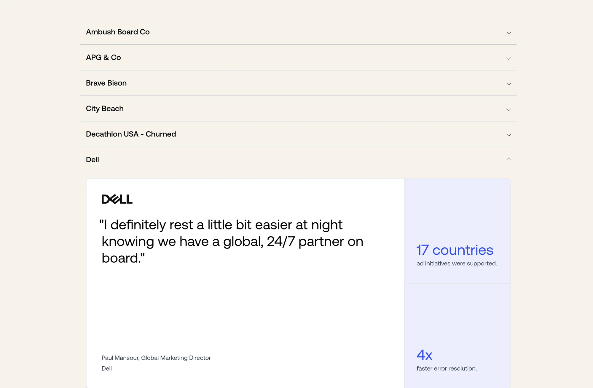
For publishers, I set up a quote library in Makeswift. Every approved quote is on one page in an accordion, one customer per row, with the finished card inside. Publishers can find a quote and its stats without asking design, and churned customers are labeled so old quotes don't get used.
The Component System, in Full
Here's everything we designed, documented, and shipped, grouped by what it does.
Navigation & Structure
Content & Typography
Interactive & Motion
Media
Data, Cards & Forms
Layout Templates
A Resources System That Scales
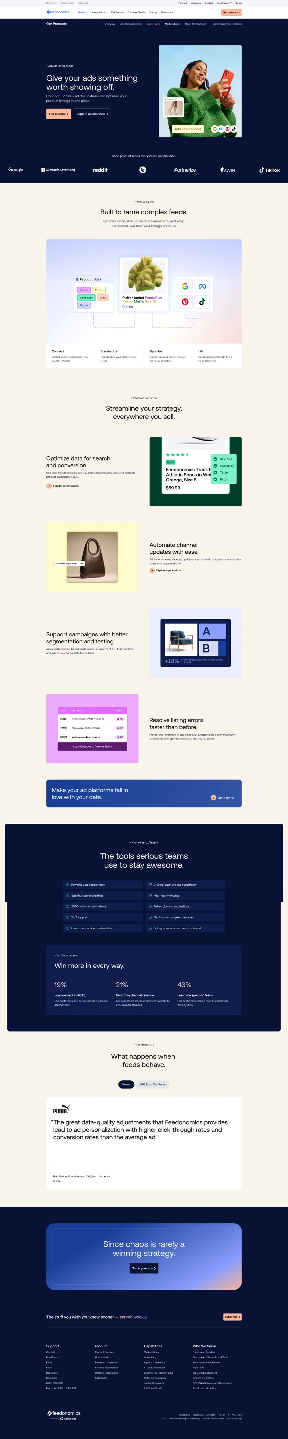
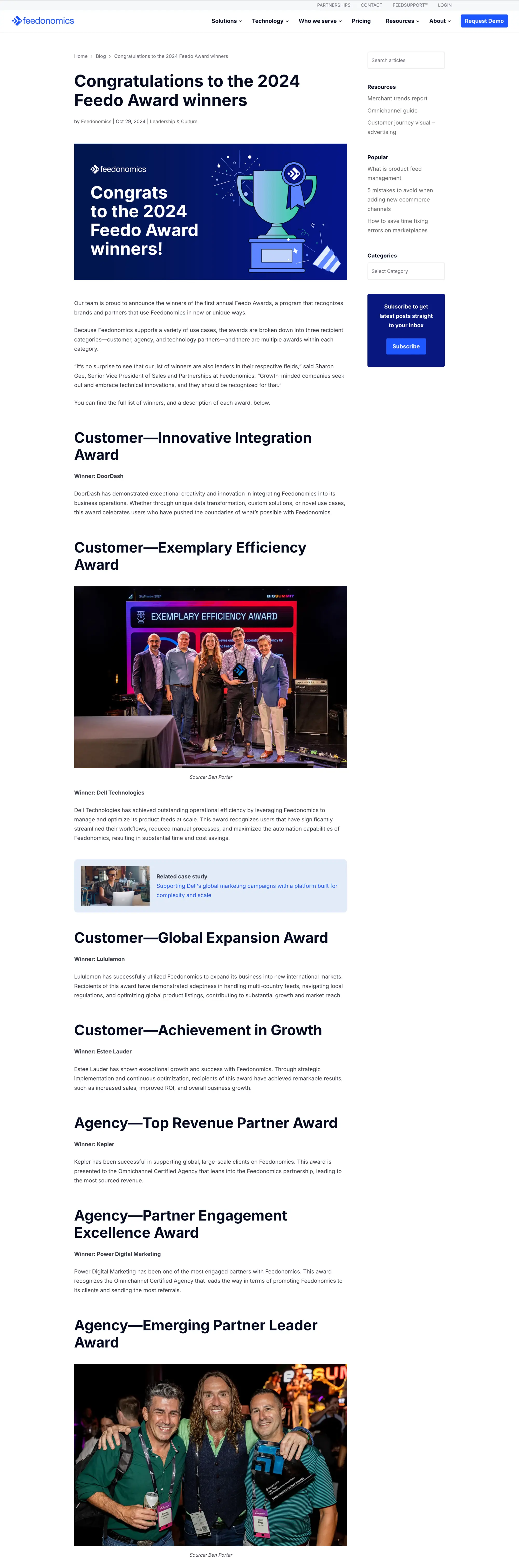
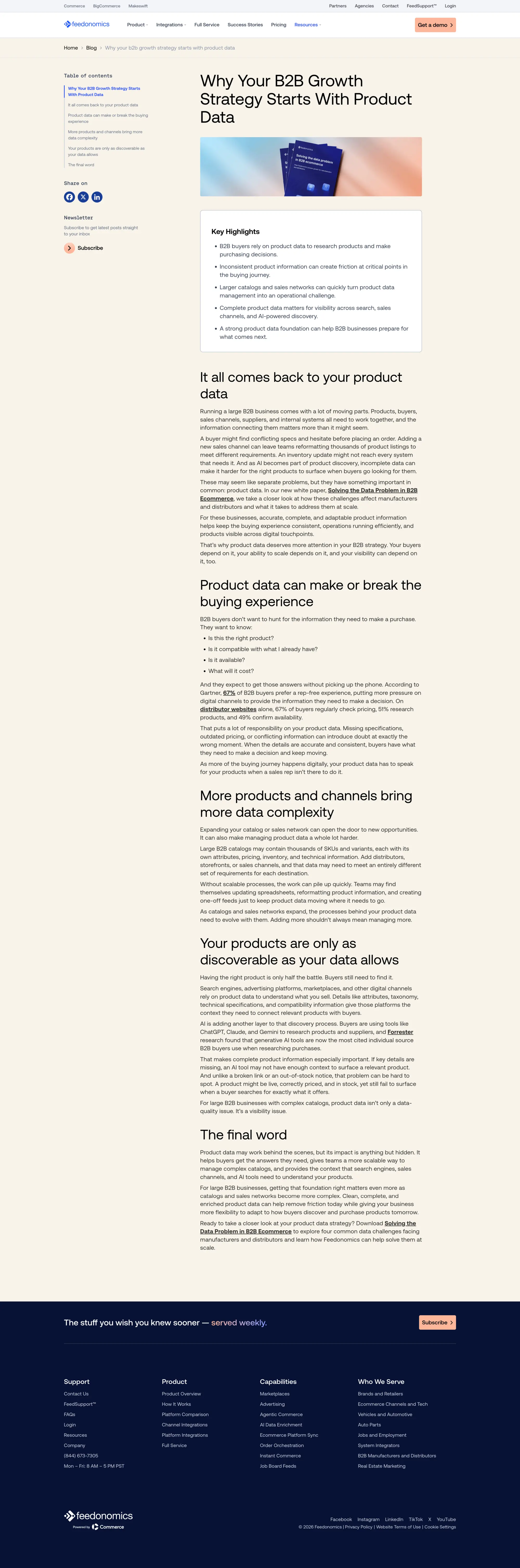
The biggest piece of the project was the resources section. Feedonomics has a blog, success stories, webinars, and gated guides and whitepapers, and the old site built each one separately. I designed one layout system for the resources hub, plus child page templates that reuse as much of it as possible and only change what each content type needs.
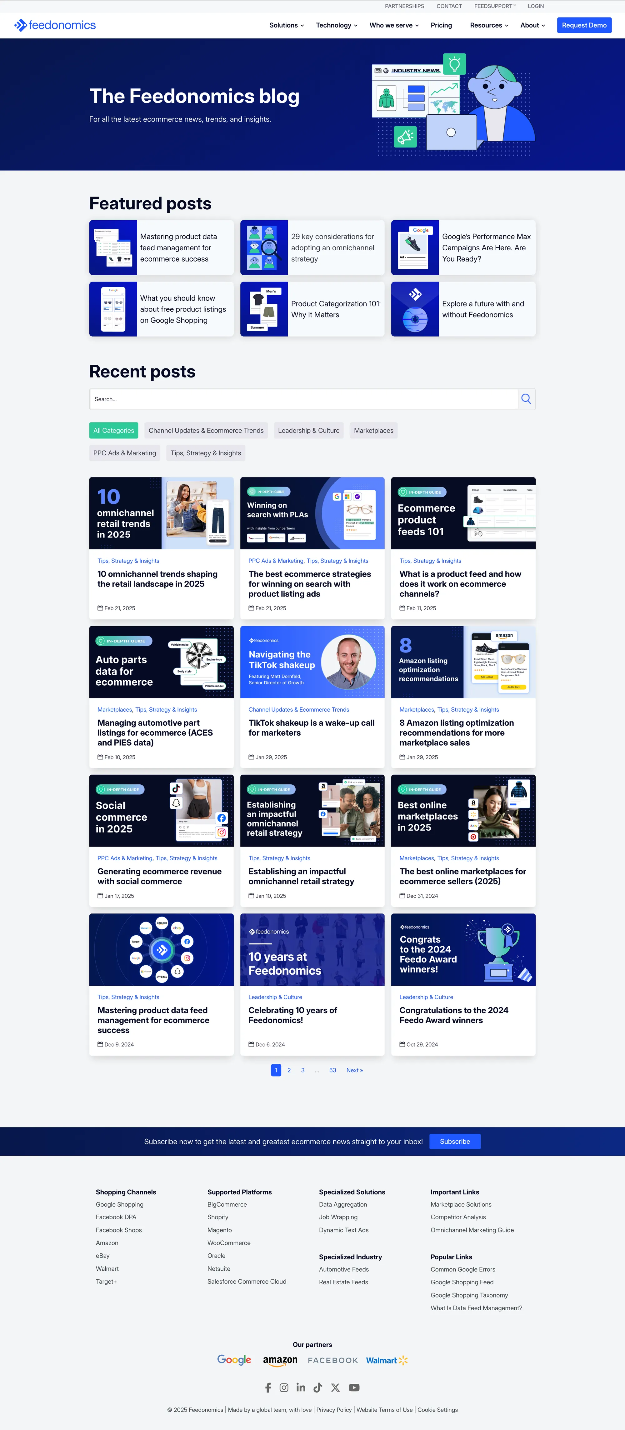
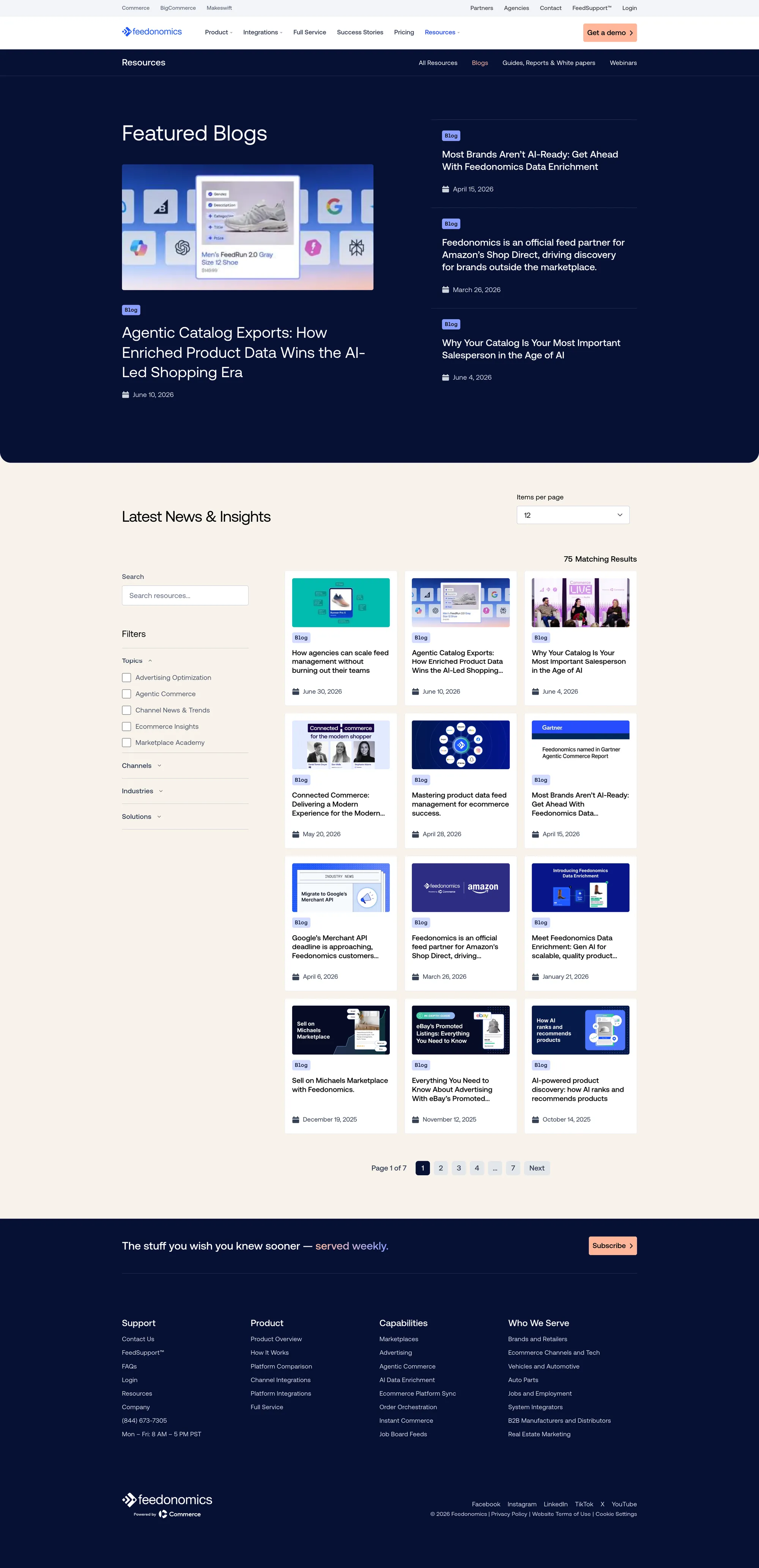
The blog post template follows the same approach. The old one was a white page with a generic sidebar. The new one uses the Stone background, a table of contents that follows you as you scroll, share and newsletter links, a key highlights box at the top, and the same type and spacing as every other page. Success stories, webinars, and guides use the same frame.
What I Recommend
If you're doing a rebrand and a platform move at the same time, build the system in the order people will need it. Tokens first, so the brand has names before it has pages. Then documentation, so developers build from specs instead of screenshots. Then a review process with real sign-offs, so "done" means the same thing to design, publishing, and SEO.
The real test of a design system is whether someone who wasn't on the project can build a page next quarter without breaking anything. That's what we built this for.