Flow Stays
A Brand Built Around Getting Into the Zone
Flow Stays is a retreat concept designed for teams and individuals who need space to do their best work. The idea is simple: get out of the office, into nature, and actually focus. The brand needed to feel calm and grounded without being too soft, so the identity leans on deep forest greens, natural textures, and a mark that nods to both shelter and the outdoors.
You can check out the live site at flowstays.com.
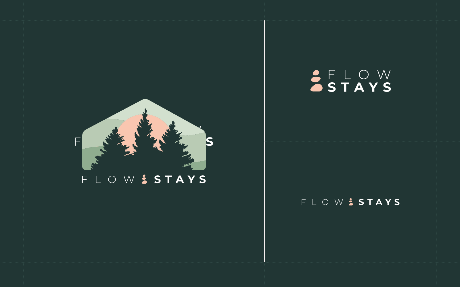
One lockup was never going to cover it. The mark has to hold up on a welcome sign at the head of a gravel drive, on a key card, and on a square avatar, so the identity was drawn as a small suite instead. The primary badge keeps the whole scene, the tent roof, the ridgeline, the rising sun, and the tree line. When there isn't room for that, the cairn steps out on its own beside a stacked wordmark. When there's less room still, the wordmark runs flat and the cairn holds the space between FLOW and STAYS. The same geometry sits underneath all three, and that is what keeps them reading as one brand rather than three that happen to share a color.
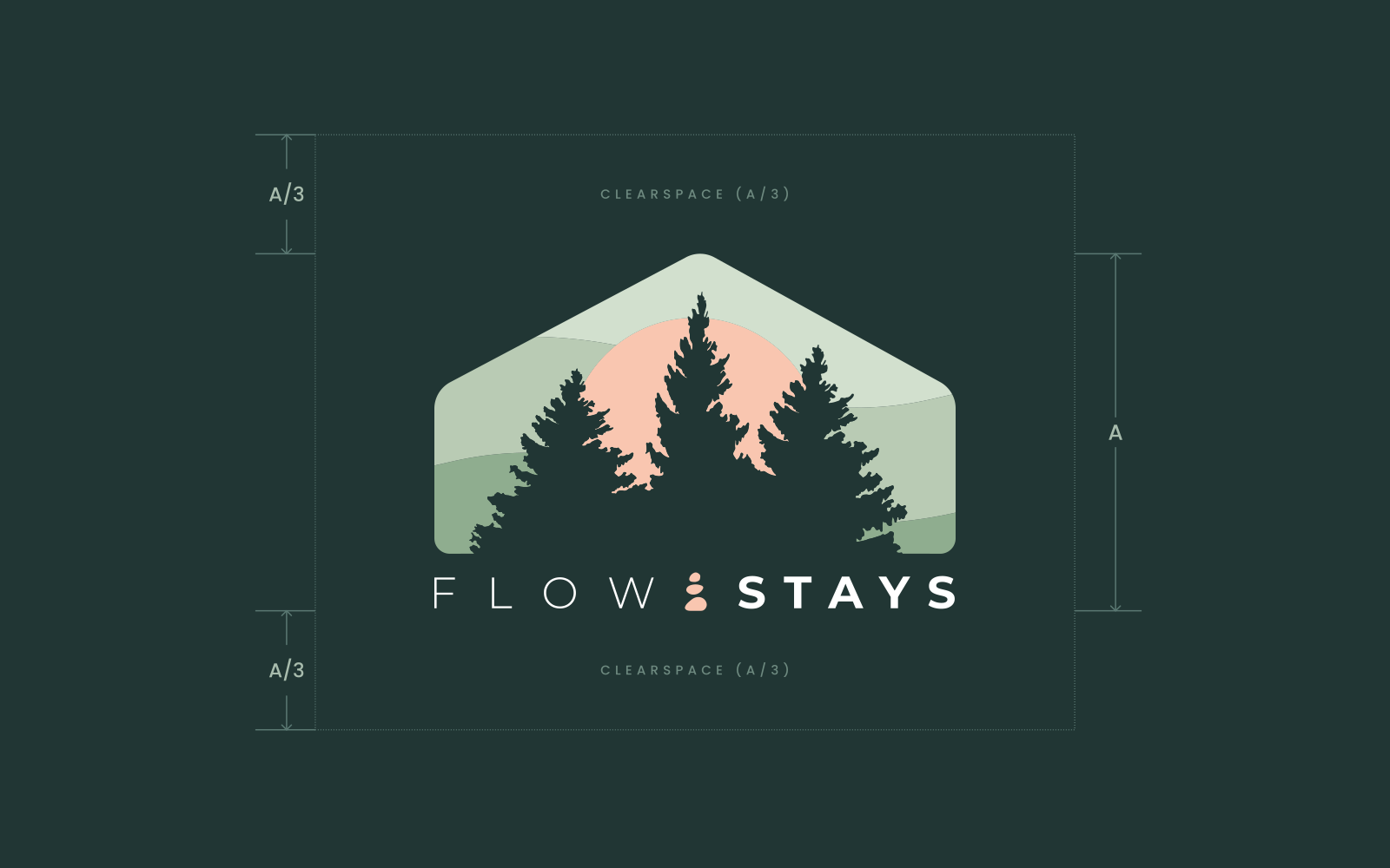
The badge gets most of its calm from the space around it. Clearspace is measured off the lockup's own height, a third of it on every side, with nothing allowed to cross the line. Defining it as a ratio rather than a pixel value means the rule scales with the mark, so it still holds on a trailhead sign and on a favicon without anyone having to measure it twice.
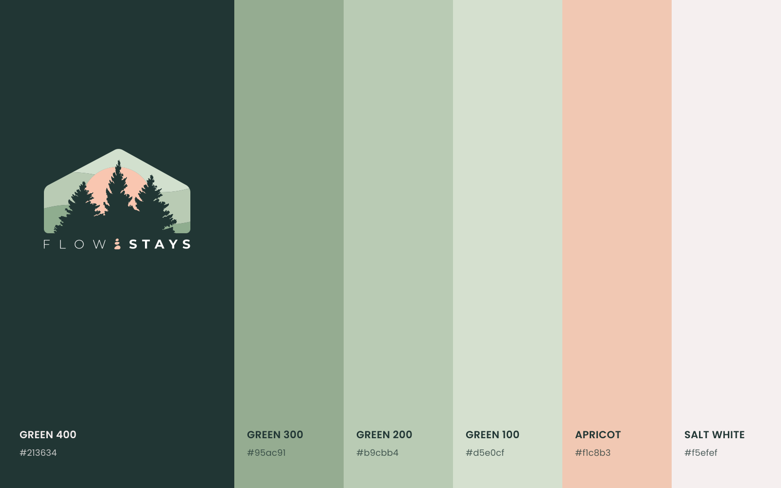
Color carries the rest of it. The four greens run from a near black forest tone down to a pale sage, which gives the system somewhere to go without ever reaching for a second hue. Apricot is the only warm note in the set, and it stays rare on purpose, a sunrise rather than a highlight. Salt white does the quiet work of keeping everything else breathing.